

Marketplace App Boilerplate
A boilerplate is a fitting template to describe distinct repetitive segments of a project to help build projects quickly and efficiently.
They can define project-level elements or standard methods for one or more projects.
For more details about the Marketplace App Boilerplate, download the GitHub repository.
Why You Should Use the Marketplace App Boilerplate?
- The boilerplate code includes all categories of applications you can create in Contentstack, i.e., custom fields, sidebar extensions, and dashboard extensions.
- You can quickly create an application since the routes and infrastructure are already built for you.
- We have built a boilerplate that incorporates best practices to help you build your Contentstack application.
- With this template, you can save a considerable amount of development time.
- You can use the JSON RTE plugin within the Boilerplate App. For more information, please refer to the JSON RTE plugin documentation.
- The boilerplate now includes native support for signed requests using the reusable useVerifyAppToken hook. This enhancement allows for secure API integrations, particularly when working with protected server routes or external services that require authentication or sensitive token validation.
Structure of the Marketplace App Boilerplate
The boilerplate folder structure consists of relative files and references, making it easy to acclimate within your project. This structure also allows the boilerplate to be thoroughly portable between different stacks in Contentstack.
Below is the folder structure of the boilerplate:
MARKETPLACE-APP-BOILERPLATE/
│
├── e2e/
│   ├── pages/
│   │   ├── AssetPage.ts
│   │   ├── EntryPage.ts
│   │   ├── GlobalFullpage.ts
│   │   └── LoginPage.ts
│   ├── tests/
│   │   ├── app-flow.spec.ts
│   │   └── org-app-flow.spec.ts
│   ├── types.ts
│   └── utils/
│       └── helper.ts
│
├── public/
│   ├── default-app-icon.svg
│   ├── favicon.ico
│   ├── logo192.png
│   ├── logo512.png
│   ├── manifest.json
│   └── robots.txt
│
├── src/
│   ├── assets/
│   │   ├── appconfig.svg
│   │   ├── Asset-Sidebar-Logo.svg
│   │   ├── assetsidebar.svg
│   │   ├── close-button.svg
│   │   ├── Content-Type-Sidebar-Logo.svg
│   │   ├── Custom-Field-Logo.svg
│   │   ├── customfield.svg
│   │   ├── Entry-Sidebar-Logo.svg
│   │   ├── Field_Modifier.svg
│   │   ├── Field-Modifier-Icon.svg
│   │   ├── Full-Page-Logo.svg
│   │   ├── fullscreen.svg
│   │   ├── fullScreenGraphics.svg
│   │   ├── GearSix.svg
│   │   ├── help_icon.svg
│   │   ├── Icon.svg
│   │   ├── JsonView.svg
│   │   ├── lock.svg
│   │   └── sidebarwidget.svg
│   │
│   ├── common/
│   │   ├── contexts/
│   │   │   ├── appConfigurationExtensionContext.ts
│   │   │   ├── customFieldExtensionContext.ts
│   │   │   ├── entrySidebarExtensionContext.ts
│   │   │   └── marketplaceContext.ts
│   │   ├── hooks/
│   │   │   ├── useAppConfig.test.tsx
│   │   │   ├── useAppConfig.ts
│   │   │   ├── useAppLocation.ts
│   │   │   ├── useAppSdk.test.tsx
│   │   │   ├── useAppSdk.tsx
│   │   │   ├── useCustomField.test.tsx
│   │   │   ├── useCustomField.tsx
│   │   │   ├── useEntry.tsx
│   │   │   ├── useFrame.ts
│   │   │   ├── useHostUrl.ts
│   │   │   ├── useInstallationData.tsx
│   │   │   ├── useSdkDataByPath.test.tsx
│   │   │   ├── useSdkDataByPath.ts
│   │   │   └── useVerifyAppToken.tsx
│   │   ├── locales/
│   │   │   └── en-us/
│   │   │       └── index.ts
│   │   ├── providers/
│   │   │   ├── AppConfigurationExtensionProvider.tsx
│   │   │   ├── CustomFieldExtensionProvider.tsx
│   │   │   ├── EntrySidebarExtensionProvider.tsx
│   │   │   └── MarketplaceAppProvider.tsx
│   │   ├── types/
│   │   │   └── types.ts
│   │   └── utils/
│   │       └── functions.ts
│   │
│   ├── components/
│   │   ├── ConfigModal/
│   │   │   ├── ConfigModal.css
│   │   │   └── ConfigModal.tsx
│   │   ├── AppFailed.tsx
│   │   └── ErrorBoundary.tsx
│   │
│   ├── containers/
│   │   ├── 404/
│   │   │   └── 404.tsx
│   │   ├── App/
│   │   │   └── App.tsx
│   │   ├── AppConfiguration/
│   │   │   ├── AppConfiguration.module.css
│   │   │   └── AppConfiguration.tsx
│   │   ├── AssetSidebarWidget/
│   │   │   ├── AssetSidebar.css
│   │   │   └── AssetSidebar.tsx
│   │   ├── ContentTypeSidebar/
│   │   │   ├── ContentTypeSidebar.css
│   │   │   └── ContentTypeSidebar.tsx
│   │   ├── CustomField/
│   │   │   ├── CustomField.css
│   │   │   ├── CustomField.test.tsx
│   │   │   └── CustomField.tsx
│   │   ├── DashboardWidget/
│   │   │   ├── StackDashboard.css
│   │   │   └── StackDashboard.tsx
│   │   ├── FieldModifier/
│   │   │   ├── FieldModifier.module.css
│   │   │   └── FieldModifier.tsx
│   │   ├── FullPage/
│   │   │   ├── FullPage.css
│   │   │   └── FullPage.tsx
│   │   ├── GlobalFullPage/
│   │   │   ├── GlobalFullPage.css
│   │   │   └── GlobalFullPage.tsx
│   │   ├── SidebarWidget/
│   │   │   ├── EntrySidebar.css
│   │   │   ├── EntrySidebar.test.tsx
│   │   │   └── EntrySidebar.tsx
│   │   ├── Tooltip/
│   │   │   ├── Tooltip.module.css
│   │   │   └── Tooltip.tsx
│   │   ├── index.css
│   │   └── index.tsx
│   │
│   ├── test-utils/
│   │   └── test-utils.tsx
│   │
│   ├── cssModules.d.ts
│   ├── custom.d.ts
│   ├── env.d.ts
│   ├── index.css
│   ├── main.tsx
│   ├── react-app-env.d.ts
│   └── setupTests.ts
│
├── CODEOWNERS
├── global-setup.ts
├── global-teardown.ts
├── index.html
├── LICENSE
├── manifest.json
├── package.json
├── package-lock.json
├── playwright.config.ts
├── README.md
├── SECURITY.md
├── tsconfig.json
├── tsconfig.node.json
└── vite.config.ts
Below are the app routes for each location in App.tsx: You can check the folder containing the file as shown below: src/containers/App/App.tsx
function App() {
  return (
    <ErrorBoundary>
      <MarketplaceAppProvider>
        <Routes>
          <Route path="/" element={<DefaultPage />} />
          <Route
            path="/custom-field"
            element={
              <Suspense>
                <CustomFieldExtensionProvider>
                  <CustomFieldExtension />
                </CustomFieldExtensionProvider>
              </Suspense>
            }
          />
          <Route
            path="/entry-sidebar"
            element={
              <Suspense>
                <EntrySidebarExtensionProvider>
                  <EntrySidebarExtension />
                </EntrySidebarExtensionProvider>
              </Suspense>
            }
          />
          <Route
            path="/app-configuration"
            element={
              <Suspense>
                <AppConfigurationExtensionProvider>
                  <AppConfigurationExtension />
                </AppConfigurationExtensionProvider>
              </Suspense>
            }
          />
          <Route
            path="/asset-sidebar"
            element={
              <Suspense>
                <AssetSidebarExtension />
              </Suspense>
            }
          />
          <Route
            path="/stack-dashboard"
            element={
              <Suspense>
                <StackDashboardExtension />
              </Suspense>
            }
          />
          <Route
            path="/full-page"
            element={
              <Suspense>
                <FullPageExtension />
              </Suspense>
            }
          />
          <Route
            path="/global-full-page"
            element={
              <Suspense>
                <GlobalFullPageExtension />
              </Suspense>
            }
          />
          <Route
            path="/field-modifier"
            element={
              <Suspense>
                <FieldModifierExtension />
              </Suspense>
            }
          />
          <Route
            path="/content-type-sidebar"
            element={
              <Suspense>
                <ContentTypeSidebarExtension />
              </Suspense>
            }
          />
          <Route path="*" element={<PageNotFound />} />
        </Routes>
      </MarketplaceAppProvider>
    </ErrorBoundary>
  );
}
export default App;
Using the Marketplace App Boilerplate to Develop Custom Applications
To get started with building applications using the boilerplate, follow the steps given below:
Prerequisites
- Contentstack account
- Contentstack App Framework and knowledge of app development
- Reference to App SDK
- Node.js 20.17.0 or higher for Venus-components and boilerplate
Install Dependencies
- Navigate to the root directory of the downloaded zip file.
- Run the following command to install the necessary packages:
npm install
- After you install the packages, run the following command to get started:
npm run dev
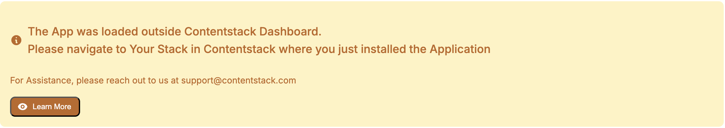
The following output appears in your browser once the localhost is running. This indicates everything is working as expected.
Creating a Project Using the Boilerplate
To use your application, you need to upload it to Contentstack. To do so, follow the steps given below:
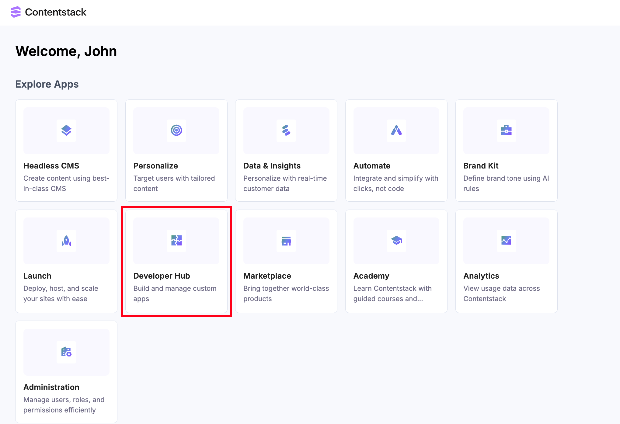
- Log in to your Contentstack account.
- On the Dashboard page, click the Developer Hub icon as shown below:
- Click the + New App button.
- Contentstack supports two types of Apps based on two categories: Standard and Machine to Machine.
Additional Resource: Refer to the Creating an App in Developer Hub document to know more about Standard and Machine to Machine app categories.
- In the Create Standard App modal, select the App Type, and give a suitable app Name and an optional Description.
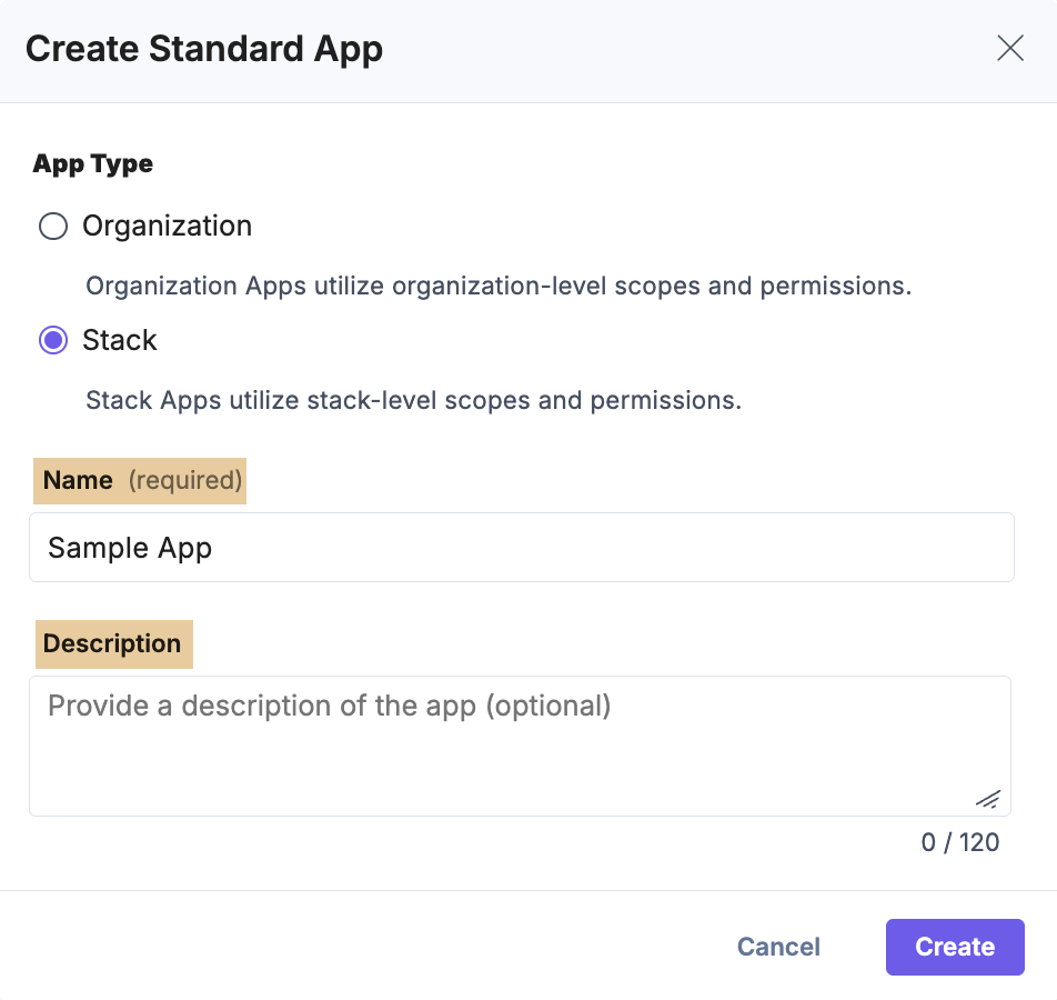
- Click Create. You will be redirected to the UI Locations landing page.
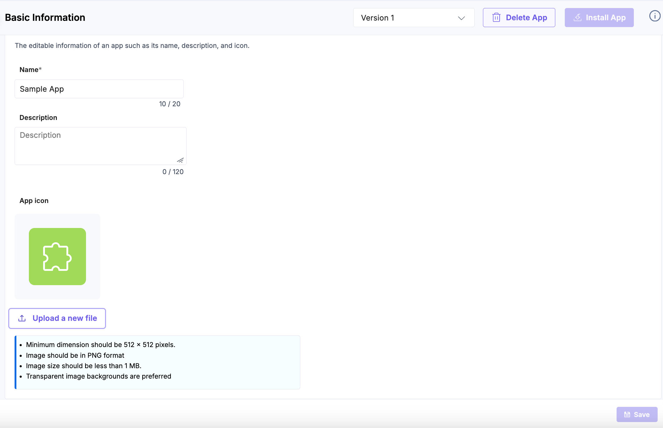
- To continue, go to the Manage section and select the Basic Information tab.
- On the resulting Basic Information page, upload your app’s icon and Save the changes.
Note: The Save button is enabled only after you edit the app’s editable details.
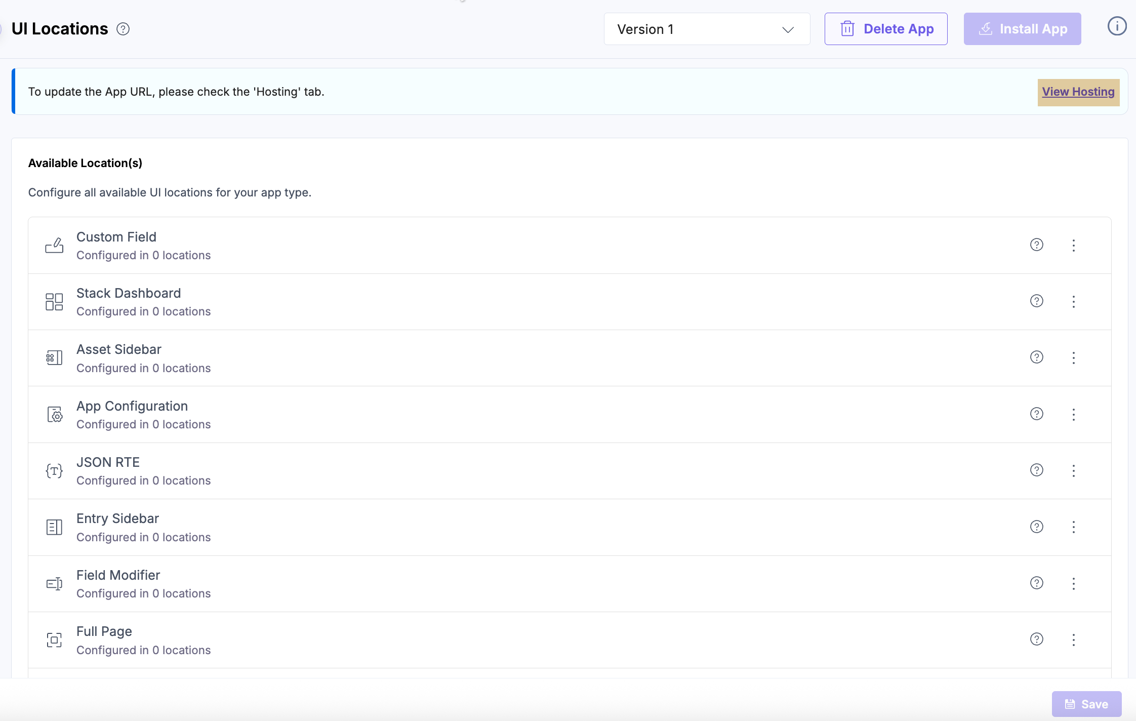
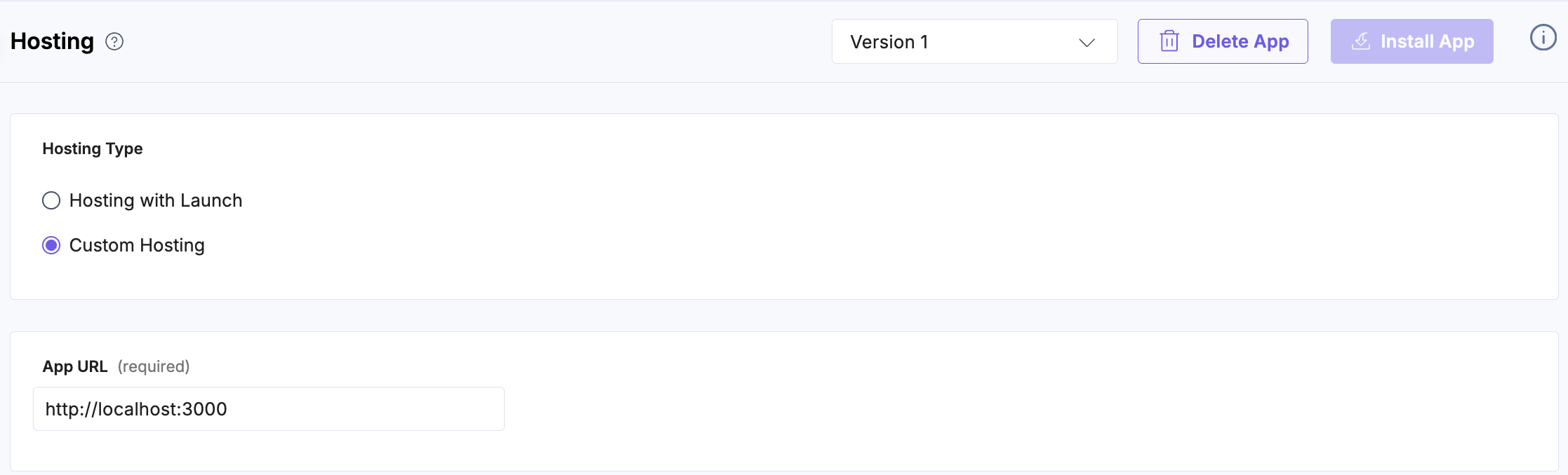
- Click the UI Locations tab. To set the App URL, click the View Hosting link. You will be redirected to the Hosting tab.
- In the Hosting tab, you can select Hosting with Launch or Custom Hosting options. Select the Custom Hosting option to enter the hosted URL of your application. Enter the App URL and click Save to confirm your hosting configuration.
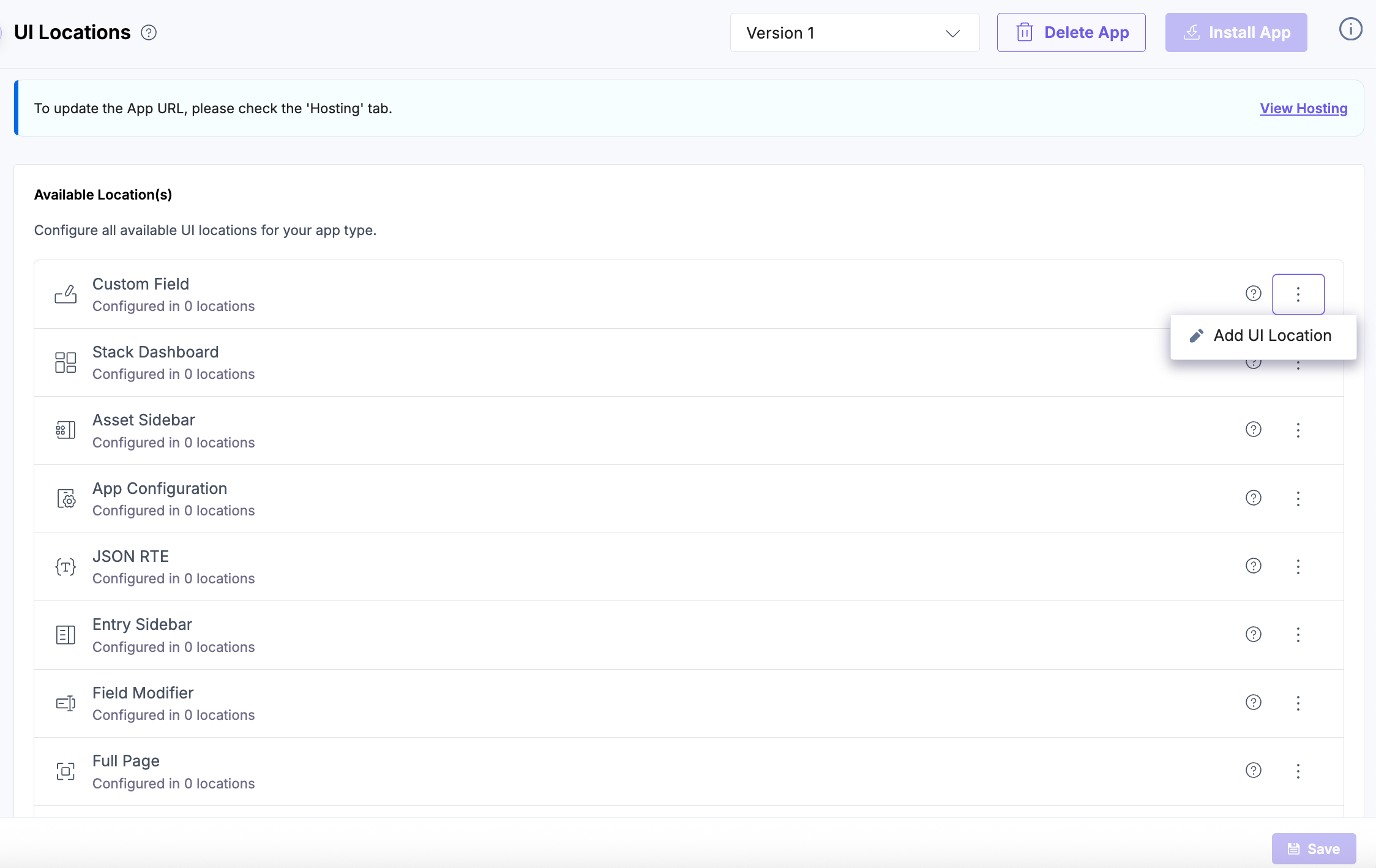
- Navigate back to the UI Locations tab, click the vertical ellipses, then click the + Add UI Location button to add as needed.
- Add the below routes for each UI Location to get the desired results.
Note: The name for each UI Location is optional, and can be used to override the default app name.
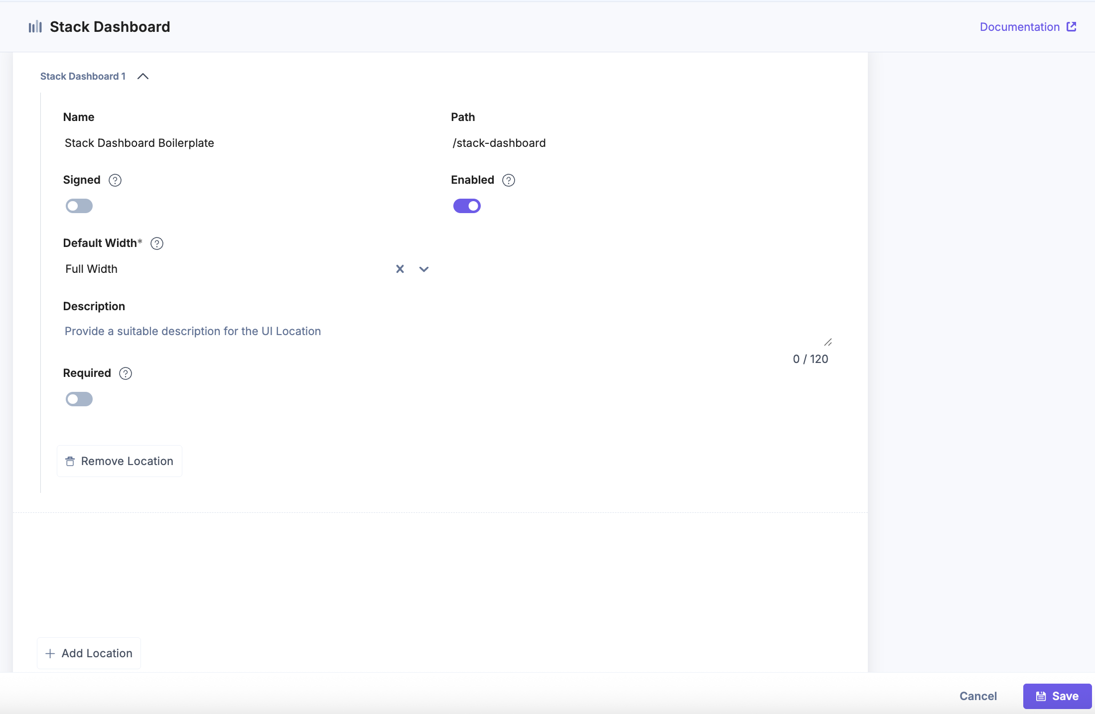
- Stack Dashboard
Enter a Name, use /stack-dashboard as the Path, and select the Default Width, then click Save to apply and store your configuration. This setup ensures your app appears as a widget on the Stack Dashboard.
Note: The Save button becomes active once all required fields are completed.
- Asset Sidebar
Enter a Name and use /asset-sidebar as the Path, then click Save to apply and store your configuration. This setup ensures your app appears in the sidebar of the Asset panel, allowing users to interact with asset-related functionality.

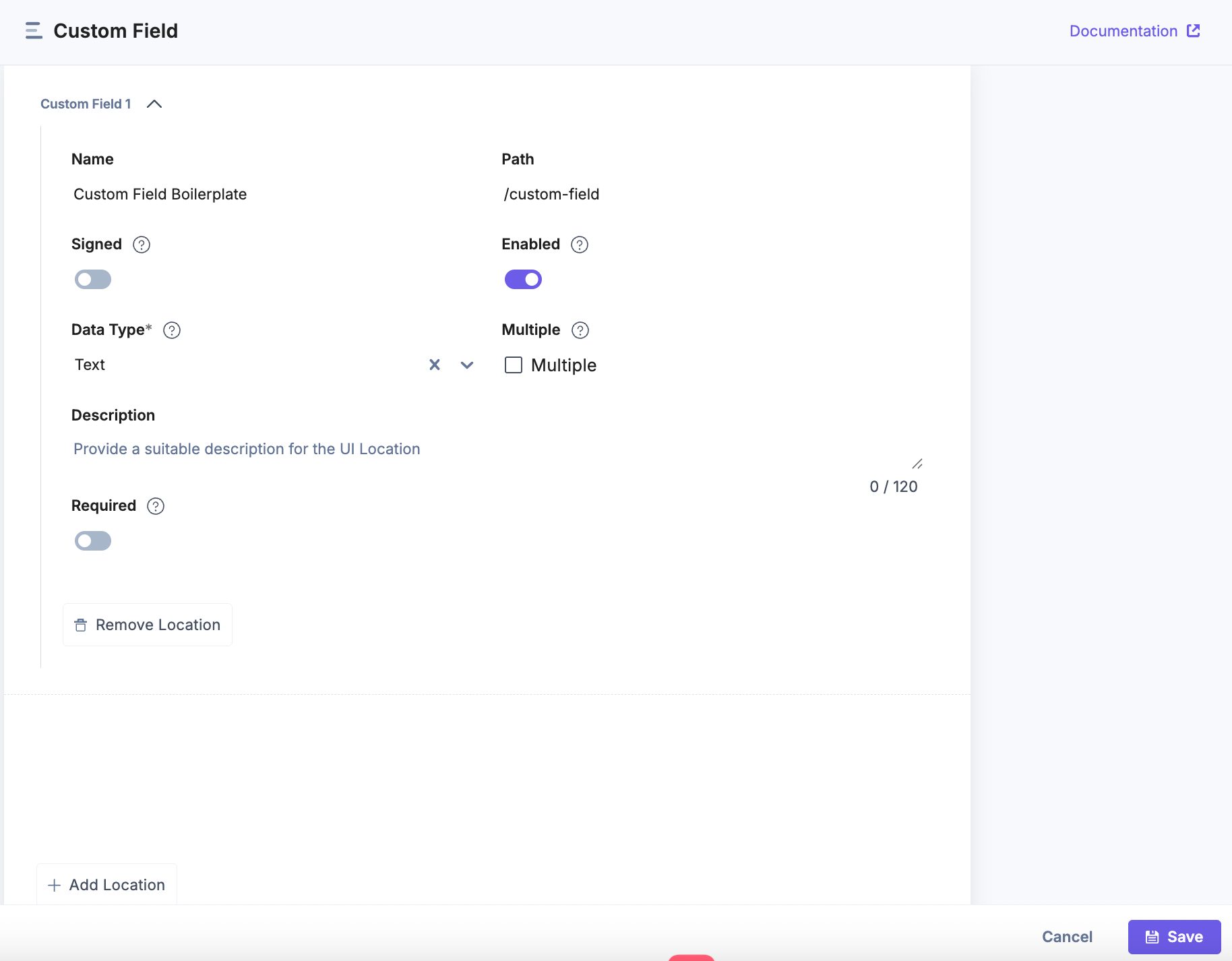
- Custom Field
Enter a Name, use /custom-field as the Path, and select the Data Type, then click Save to apply and store your configuration. This setup ensures your app appears as a custom field within entries, allowing users to input or display data through your app’s interface.
Note: The Save button becomes active once all required fields are completed.
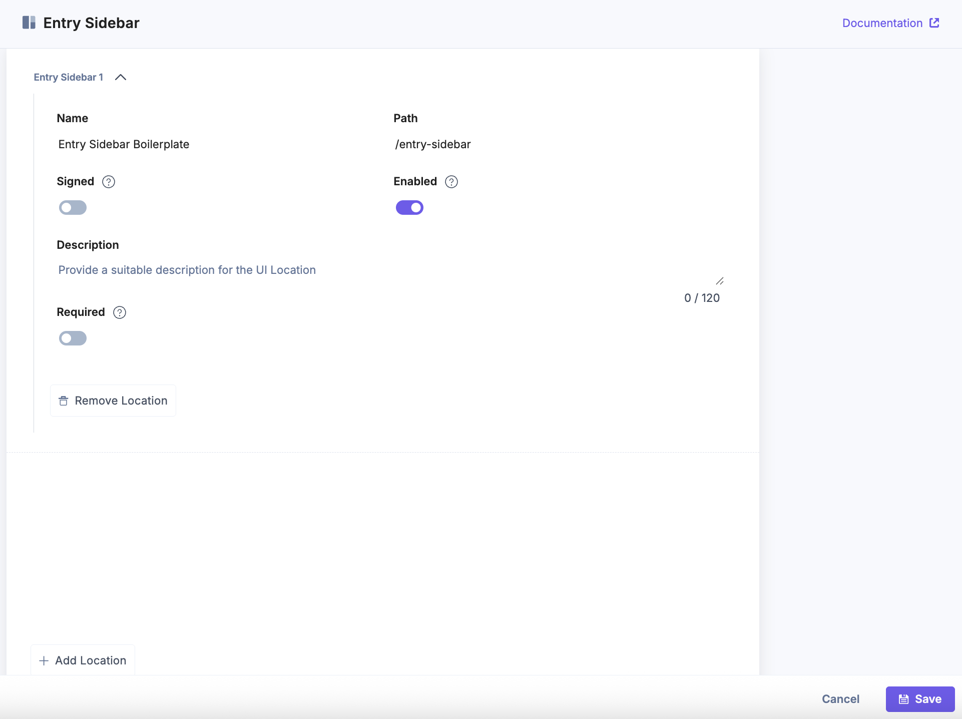
- Entry Sidebar
Enter a Name and use/entry-sidebaras the Path, then click Save to apply and store your configuration. This setup ensures your app appears in the sidebar of the entry editor, allowing users to perform actions or view information related to an entry.
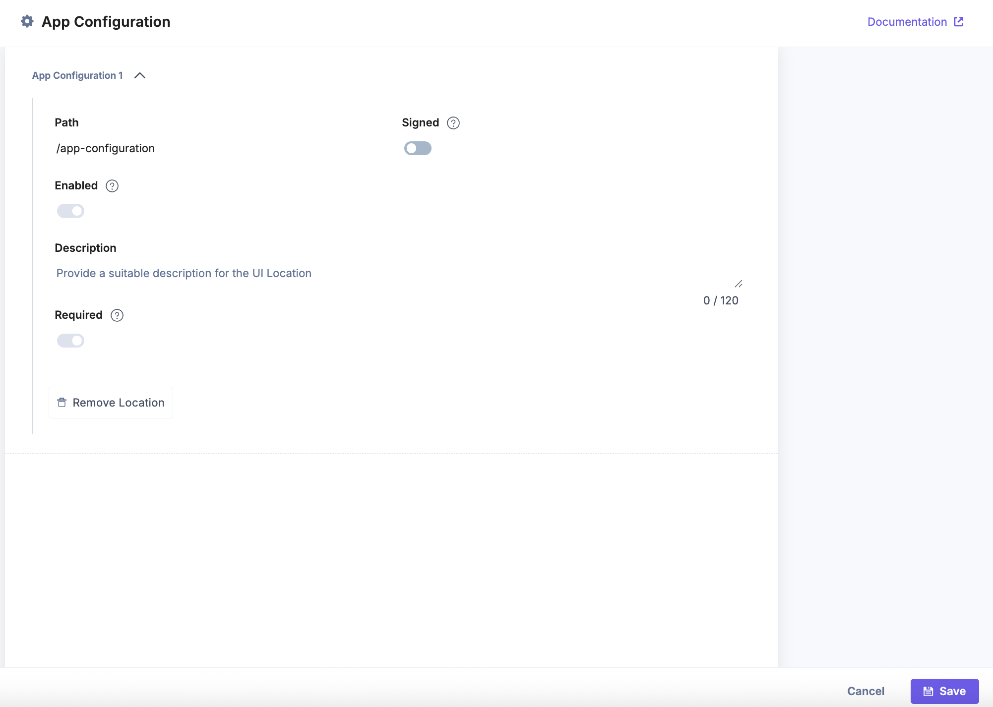
- App Configuration
Enter /app-configuration as the Path, then click Save to apply and store your configuration. This setup allows your app to display a dedicated app configuration page (after app installation) where users can manage app configuration.
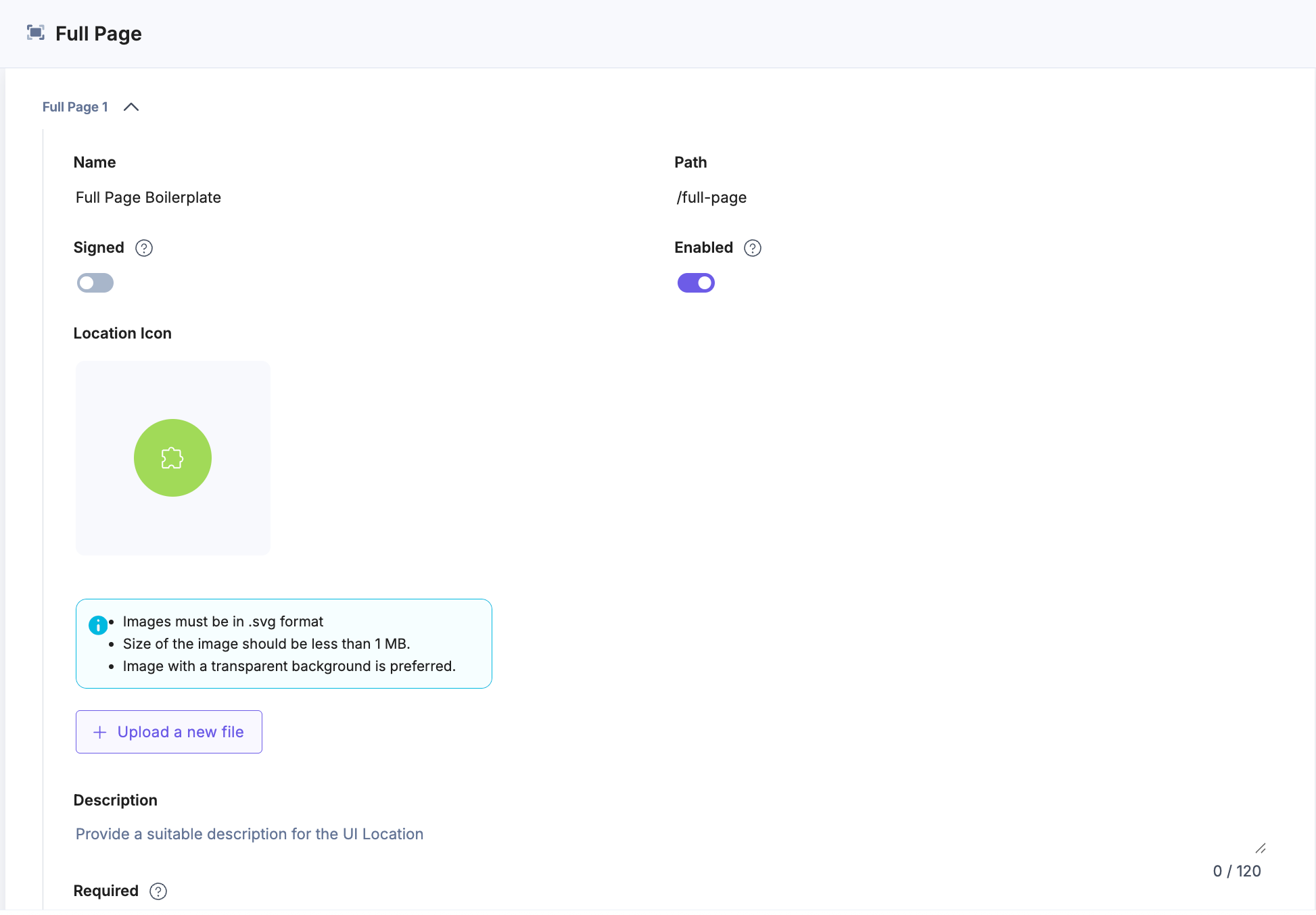
- Full Page
Enter a Name and use /full-page as the Path, then click Save to apply and store your configuration. This setup enables your app to appear as a standalone full-page view within the stack.
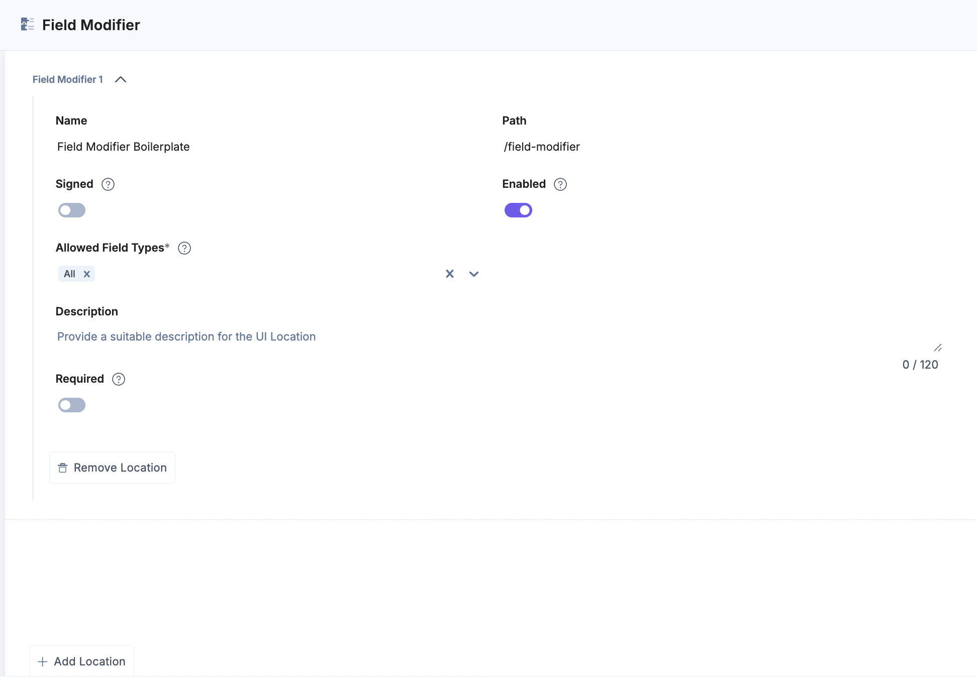
- Field Modifier
Enter a Name, use /field-modifier as the Path, and select the Allowed Field Types, then click Save to apply and store your configuration. This setup ensures your app can modify the specified field types within entries.
Note: The Save button becomes active once all required fields are completed.
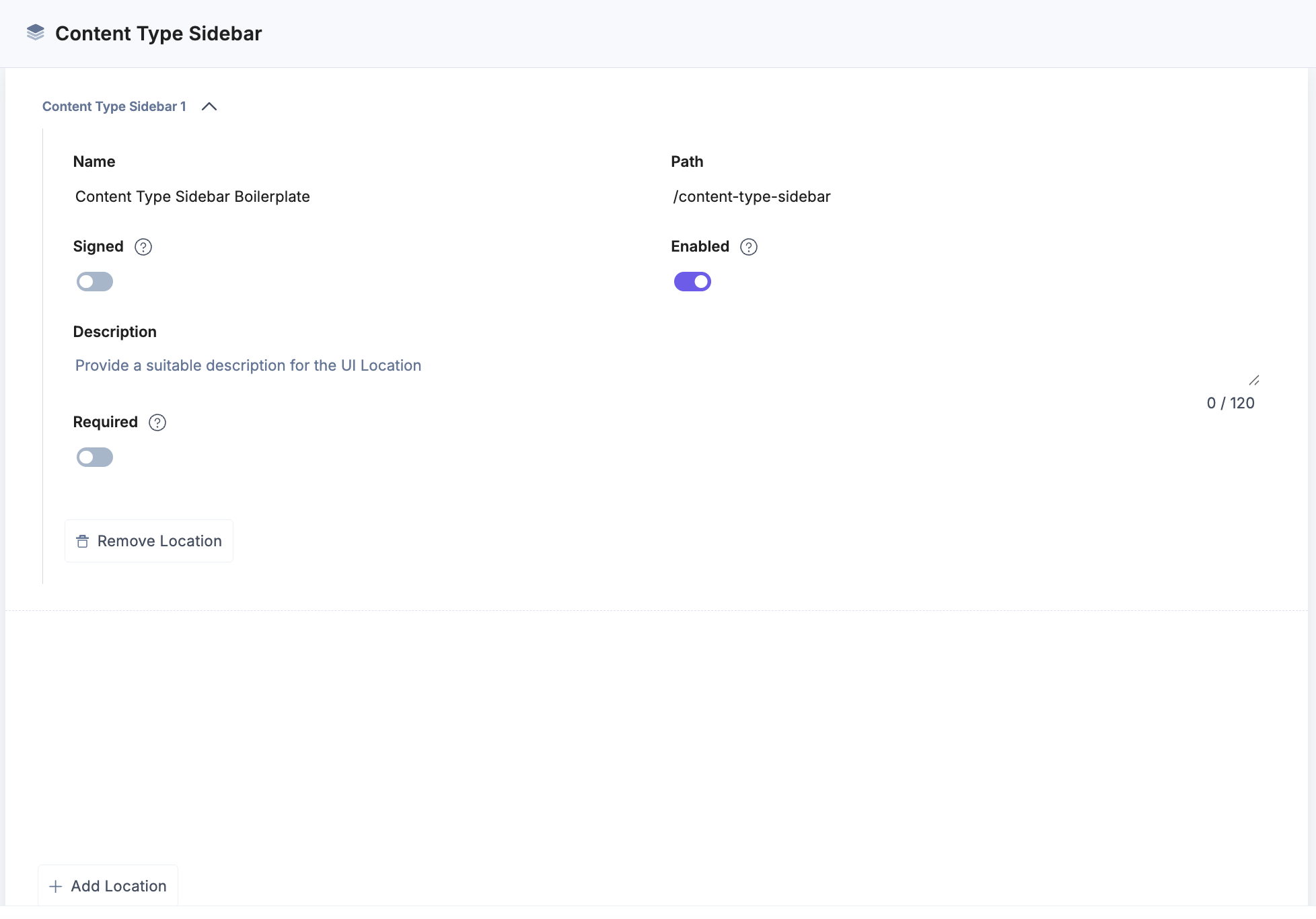
- Content Type Sidebar
Enter a Name and use /content-type-sidebar as the Path, then click Save to apply and store your configuration. This setup ensures your app appears in the sidebar of the Content Type editor, allowing users to manage content type settings directly through your app.
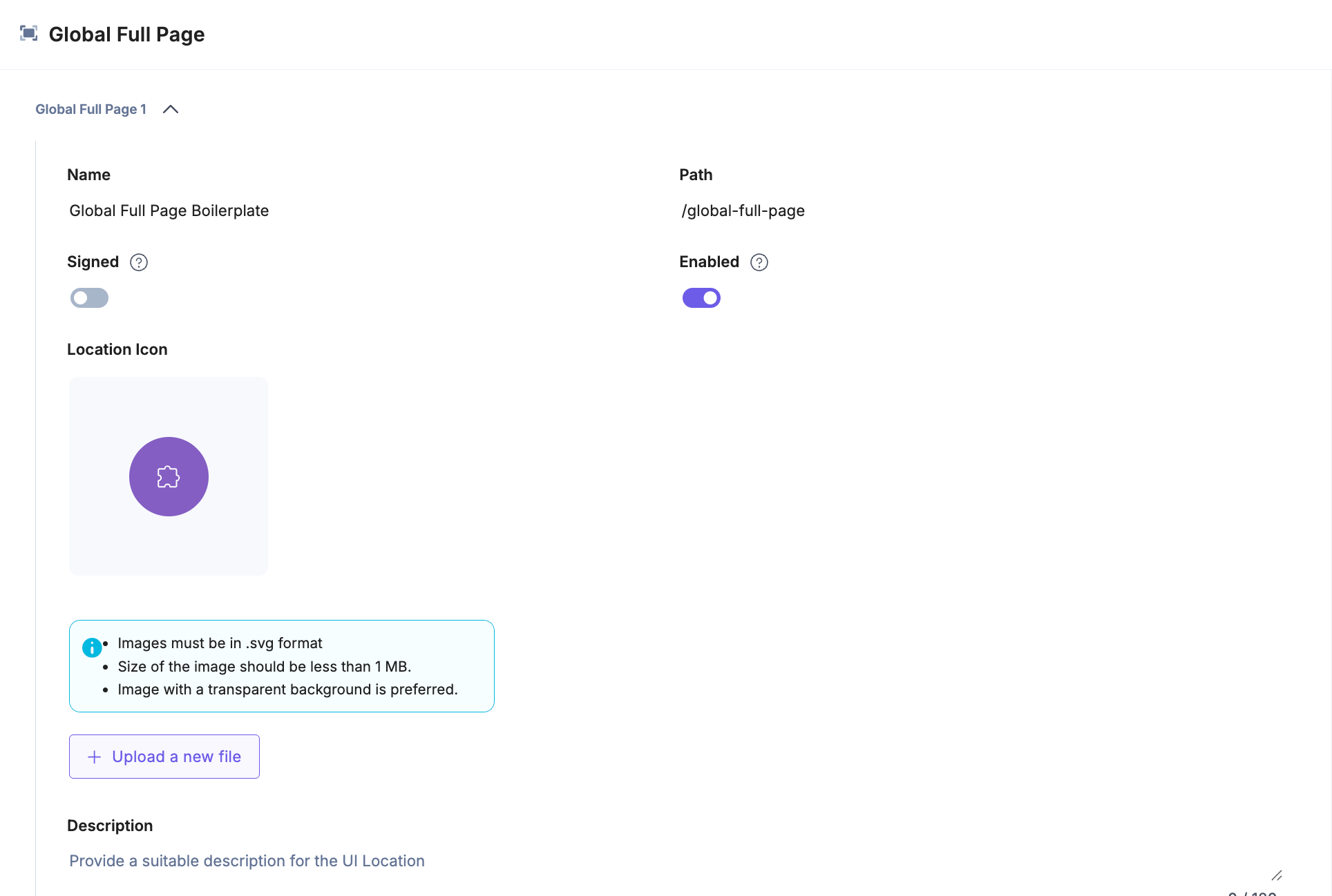
- Global Full Page
Enter a Name and use /global-full-page as the Path, then click Save to apply and store your configuration. This setup enables your app to appear as a full-page view accessible across all stacks in the organization.
Note: You must create an Organization app to use this UI location.
- Stack Dashboard
Note: After saving the locations, on the UI Locations screen, click Install App to install the app in a stack.
- Select the stack where you want to install the app and click the Install button.
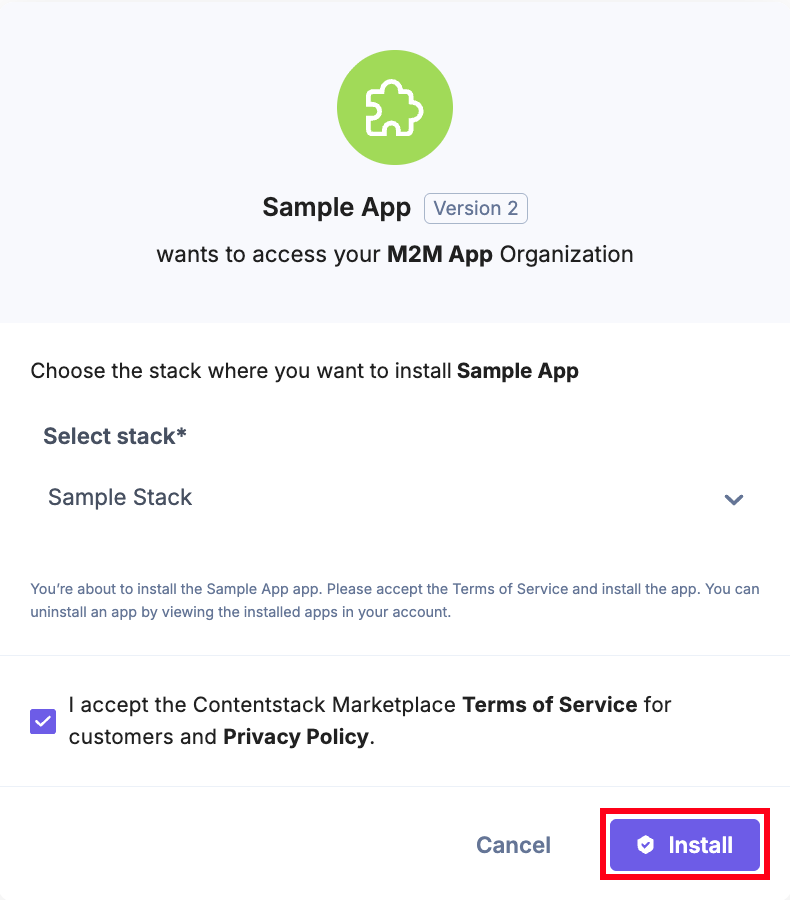
- You will be redirected to the configuration page of the app.
Note: The App Configuration page is visible only if the App Configuration UI Location is set up. Not all apps (for example, the Color Picker app) require this configuration. Set up the App Configuration location only if your app needs any configuration.
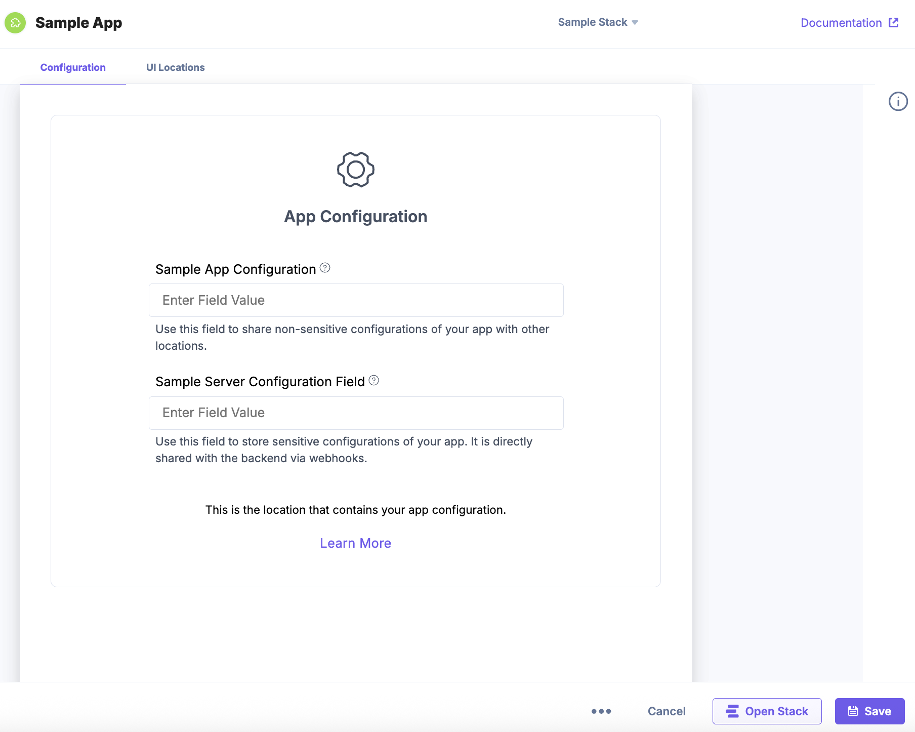
- On the App Configuration page, enter the values for Sample App Configuration field and Sample Server Configuration field.
Let’s understand the configuration fields:
- Sample App Configuration: You can save non-sensitive data that you want to show in different UI locations. For example, if you want to create a form with Username, Date, Email Address, etc. then, you can add the value in the field and view the data in the configured UI location(s).
- Sample Server Configuration: You can save sensitive data. For example, if you want to create a form with Password, Client Secret, and Client ID then, you can enter a value in the Sample Server Configuration Field and the value will be stored in the backend via webhooks.
Additional Resource: To learn more, refer to the App Configuration document.
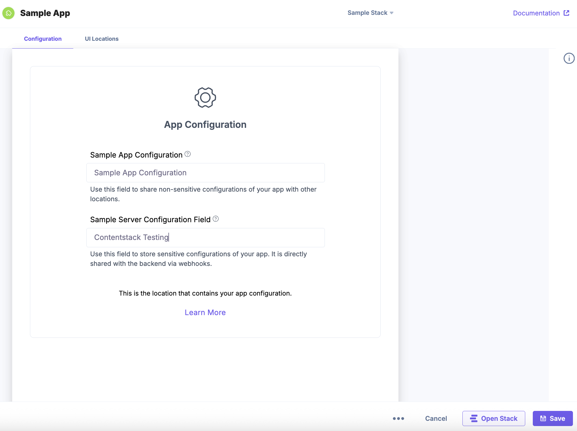
Note: The values entered in the Sample App Configuration and Sample Server Configuration fields are displayed across all UI locations configured for the app.
Let’s understand how you can use the Sample App Configuration and Sample Server Configuration fields. These fields act as a template to use before developing an application. You can save the values in these fields based on the requirement (sensitive and non-sensitive) and view them in the configured UI location(s).
Here is a sample code snippet for Sample App Configuration and Sample Server Configuration fields:
Add the code in the ../src/containers/AppConfiguration/AppConfiguration.tsx file.
import React, { useRef } from "react"; import Icon from "../../assets/GearSix.svg"; import localeTexts from "../../common/locales/en-us/index"; import parse from "html-react-parser"; import styles from "./AppConfiguration.module.css"; import { useInstallationData } from "../../common/hooks/useInstallationData"; import Tooltip from "../Tooltip/Tooltip"; const AppConfigurationExtension: React.FC = () => { const { installationData, setInstallationData } = useInstallationData(); const appConfigDataRef = useRef<HTMLInputElement>(null); const serverConfigDataRef = useRef<HTMLInputElement>(null); const updateConfig = async () => { if (typeof setInstallationData !== "undefined") { setInstallationData({ configuration: { sample_app_configuration: appConfigDataRef.current?.value }, serverConfiguration: { sampl_server_configuration: serverConfigDataRef.current?.value }, }); } }; return ( <div className={`${styles.layoutContainer}`}> <div className={`${styles.appConfig}`}> <div className={`${styles.appConfigLogoContainer}`}> <img src={Icon} alt="icon" /> <p>{localeTexts.ConfigScreen.title}</p> </div> <div className={`${styles.configWrapper}`}> <div className={`${styles.configContainer}`}> <div className={`${styles.infoContainerWrapper}`}> <div className={`${styles.infoContainer}`}> <div className={`${styles.labelWrapper}`}> <label htmlFor="appConfigData">Sample App Configuration</label> <Tooltip content="You can save this field for information such as Username, Email, Number, Date, etc." /> </div> </div> <div className={`${styles.inputContainer}`}> <input type="text" ref={appConfigDataRef} required value={installationData.configuration.sample_app_configuration as string} placeholder="Enter Field Value" name="appConfigData" autoComplete="off" className={`${styles.fieldInput}`} onChange={updateConfig} /> </div> </div> <div className={`${styles.descriptionContainer}`}> <p>Use this field to share non-sensitive configurations of your app with other locations.</p> </div> </div> <div className={`${styles.configContainer}`}> <div className={`${styles.infoContainerWrapper}`}> <div className={`${styles.infoContainer}`}> <div className={`${styles.labelWrapper}`}> <label htmlFor="serverConfigData">Sample Server Configuration Field </label> <Tooltip content="You can use this field for information such as Passwords, API Key, Client Secret, Client ID, etc." /> </div> </div> <div className={`${styles.inputContainer}`}> <input type="text" ref={serverConfigDataRef} required value={installationData.serverConfiguration.sample_app_configuration as string} placeholder="Enter Field Value" name="serverConfigData" autoComplete="off" onChange={updateConfig} /> </div> </div> <div className={`${styles.descriptionContainer}`}> <p> Use this field to store sensitive configurations of your app. It is directly shared with the backend via webhooks. </p> </div> </div> </div> <div className={`${styles.locationDescription}`}> <p className={`${styles.locationDescriptionText}`}>{parse(localeTexts.ConfigScreen.body)}</p> <a target="_blank" rel="noreferrer" href={localeTexts.ConfigScreen.button.url}> <span className={`${styles.locationDescriptionLink}`}>{localeTexts.ConfigScreen.button.text}</span> </a> </div> </div> </div> ); }; export default AppConfigurationExtension; - Click Save and click Open Stack to start using the application.
- Navigate to the stack where your application is installed and view your application in the configured UI location.
Note: You must open the app in the configured UI location to view it.
Installing JSON RTE Plugin
To install the JSON RTE Plugin, refer to the RTE Location documentation.
Integrating Venus Component Library
Venus Component Library is Contentstack’s official React-based UI library that offers a collection of pre-built, reusable components designed to ensure consistency and accessibility across Marketplace apps and Developer Hub tools.
The library includes ready-to-use components such as buttons, modals, inputs, dropdowns, tables, and form controls, all built in alignment with Contentstack’s design system and accessibility guidelines.
Venus components can be seamlessly integrated into any React project, regardless of the build tool, including Vite, Webpack, or other modern bundlers.
Follow the instructions given below to integrate the components with existing UI extensions built using React.
Note: The following code snippet is provided for demonstration purposes only and is not available in the GitHub repository. You can use this code as a reference for integration.
Installation
Run the following command to install the Venus Component Library elements:
npm i @contentstack/venus-components
Use the following code snippet to import the css styles for the venus components.
import @contentstack/venus-components/build/main.css;Usage
Navigate to ../src/containers/DashboardWidget/StackDashboard.tsxand use the following code snippet to integrate the venus components into your file.
import { Heading, Button } from "@contentstack/venus-components";
import "@contentstack/venus-components/build/main.css";
import "../index.css";
import "./StackDashboard.css";

const StackDashboardExtension = () => {
  return (
    <div className="layout-container">
      <div className="ui-location">
        <div className="ui-container">
          <Heading tagName="h2" text="Build App using Venus component" />
          <Button
            buttonType="primary"
            onClick={() => {
              console.log("You clicked on Venus button");
            }}>
            Click on me
          </Button>
        </div>
      </div>
    </div>
  );
};
export default StackDashboardExtension;
Using Modal Component for Fullscreen View:
A modal component for fullscreen view can be added for any of the UI locations. Let us consider Stack Dashboard UI location as an example here:
Step 1: Go to /src/components/ and create a Fullscreen component “DashBoardModal.tsx” to integrate within your app
import React from "react";
import { Icon } from "@contentstack/venus-components";
import "@contentstack/venus-components/build/main.css";
export type DashBoardModalProps = {
  closeModal: () => void;
  children: React.ReactNode;
};

const DashBoardModal: React.FC<DashBoardModalProps> = ({ closeModal, children }) => {
  return (
    <div
      style={{
        width: "calc(100vw - 100px)",
        height: "calc(100vh - 100px)",
        borderRadius: "inherit",
        overflow: "hidden",
        display: "flex",
        flexDirection: "column",
      }}>
      <div className="flex FullPage_Modal_Header">
        <h6 style={{ margin: "auto auto auto 22px" }}>FullScreen View</h6>

        <Icon
          icon="Compress"
          size="small"
          className="Tab__icon mt-20"
          hover={true}
          hoverType="secondary"
          style={{ marginRight: "30px", marginLeft: "auto", cursor: "pointer" }}
          onClick={() => {
            closeModal();
          }}
        />
      </div>

      <div className="fullscreen h-full">{children}</div>
    </div>
  );
};
export default DashBoardModal;
Step 2: Create a ModalComponent.tsx file inside /src/components/ which will be used to render in the fullscreen mode.
const ModalComponent = () => {
  return (
    <div style={{ margin: "10px", padding: "10px" }}>
      <h1>Title</h1>

      <p style={{ textAlign: "justify", padding: "8px" }}>
        Lorem ipsum dolor sit amet consectetur adipisicing elit. Dolore,
        ducimus doloremque eum, a dolorum repudiandae, nostrum quas quae
        dolor tenetur saepe. Voluptas eaque praesentium ab velit consequatur
        deserunt totam, hic quidem, ipsam blanditiis vitae tempore nostrum
        officia tempora magni repudiandae consectetur laborum sint adipisci
        ex minima quas soluta esse id? Cupiditate saepe corporis suscipit!
        Molestias maiores quae blanditiis ipsa possimus, repudiandae cum?
        Iure deserunt quam blanditiis et?
      </p>
    </div>
  );
};

export default ModalComponent;
Step 3: Go to /src/containers/DashboardWidget/StackDashboard.tsx file and add the following:
import { useEffect, useRef, useState } from "react";
import { Button, cbModal } from "@contentstack/venus-components";
import { useAppSdk } from "../../common/hooks/useAppSdk";
import DashBoardModal from "../../components/DashBoardModal";
import ModalComponent from "../../components/ModalComponent";

interface StackDashboardExtensionProps {
  fullScreen?: boolean;
}

/** Stack Dashboard page component. */

const StackDashboardExtension = ({ fullScreen }: StackDashboardExtensionProps) => {
  const ref = useRef(null);
  const appSdk = useAppSdk();
  const [entries, setEntries] = useState([]);

  const selectedEnvironmentUid = "bltccf267c55327a117";
  const contentTypeUid = "content_type_changes";

  useEffect(() => {
    if (!fullScreen) {
      // @ts-ignore
      window.iframeRef = ref.current;
    }

    appSdk?.location.DashboardWidget?.frame.updateHeight(600);

    // Fetch entries
    const fetchEntries = async () => {
      if (!appSdk?.stack) return;

      const searchQuery = {
        type: "entries",
        include_publish_details: true,
        // query: { content_type_uid: contentTypeUid },
        limit: 100,
        skip: 0,
      };

      try {
        const searchResults = await appSdk.stack.search(searchQuery);
        console.log("searchResults", searchResults);

        const filteredEntries = searchResults.items
          ?.filter((entry: any) =>
            entry.publish_details?.some((detail: any) => detail.environment === selectedEnvironmentUid)
          )
          .map((entry: any) => ({
            ...entry,
            publish_details: entry.publish_details?.filter(
              (detail: any) => detail.environment === selectedEnvironmentUid
            ),
          }));

        console.log("Entries published to environment:", filteredEntries);
        setEntries(filteredEntries || []);
      } catch (error) {
        console.error("Search error:", error);
      }
    };

    fetchEntries();
  }, [appSdk, fullScreen]);

  const openModal = () => {
    cbModal({
      component: (modalProps: any) => (
        <DashBoardModal {...modalProps}>
          <StackDashboardExtension fullScreen={true} />
        </DashBoardModal>
      ),

      modalProps: {
        size: "customSize",
      },
    });
  };

  let dynamicClassName = fullScreen ? "fullScreenWrapper" : "h-screen";

  return (
    <div ref={ref} className={dynamicClassName}>
      <ModalComponent />

      {!fullScreen && (
        <Button buttonType="primary" onClick={openModal} style={{ position: "fixed", marginLeft: "20px" }}>
          Fullscreen
        </Button>
      )}
    </div>
  );
};

export default StackDashboardExtension;
Public Key Verification Setup for Signed Feature
To enable JWT verification for signed requests, you must configure a specific environment variable in your .env file.
Step 1: Add Environment Variable
Add the following line to your .env file:
VITE_PUBLIC_KEY_BASE_URL=https://app.contentstack.comStep 2: Understand the Configuration
What This Does
This variable specifies the base URL from which your application retrieves the public key used to verify JWT (JSON Web Token) signatures. By default, it points to Contentstack's AWS North America (NA) region.
Region-specific Configuration
If you are working with a Contentstack instance hosted in a different region, you can update this URL to reflect the appropriate region-specific endpoint.
Next Step
Next, you can refer to the Get Started with Building Apps using Contentstack’s App SDK guide to start creating apps using the Contentstack App SDK.
More articles in "Quickstart"
