

Guide to Build Your First Simple App
In this section, we will learn how to build a simple “Color Picker” app using the Contentstack app framework. This app contains a Custom Field UI location, which provides a native color picker polyfill that Contentstack users can use as an input field.
This step-by-step guide explains how to create a Color Picker app and use it to select color as an input within an entry.
Prerequisites
- Contentstack account with access to Developer Hub
- Organization or stack admin access
- Node.js version 16 or above
- Understanding of App SDK
- Understanding of React.js
- Venus Component Library for designing UI
Overview of steps:
- Setup a New Project
- Register the App
- Install the App
- See your App in Action
- Implement your App
- Next Steps
Setup a New Project
As a first step, you need to create a project directory where you can work in. We will be using the Marketplace App Boilerplate for creating our project.
git clone https://github.com/contentstack/marketplace-app-boilerplate.git color-picker- Navigate to the newly created folder and start the app by running the following commands:
- Switch to the project directory from CLI:
cd color-picker
- Run the below command to install all modules:
$ npm install
- Start the project:
$ npm start
This hosts your application on http://localhost:3000. We'll later connect to this through the Contentstack web app.
- Switch to the project directory from CLI:
Register the App
To register your app with Contentstack, log in to your Contentstack account and follow the steps given below:
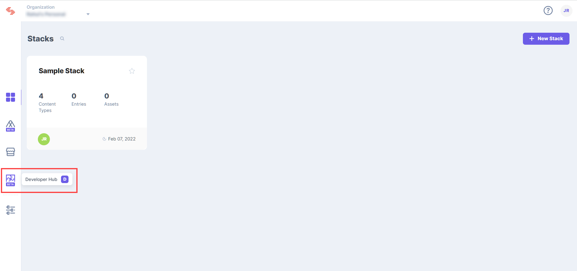
- In the left navigation panel, you will find an icon for Developer Hub (as shown below). Click the icon to go to the Developer Hub.
- Click the + New App button.
- In the New App modal that appears, enter the following details:
- Type of App (required): Select Stack App as we plan to create a custom field UI location within a stack.
- Name (required): Enter the name of your app. This can be whatever you want, we chose "Color Picker" for this tutorial.
- Description (optional): Enter a description for your app.
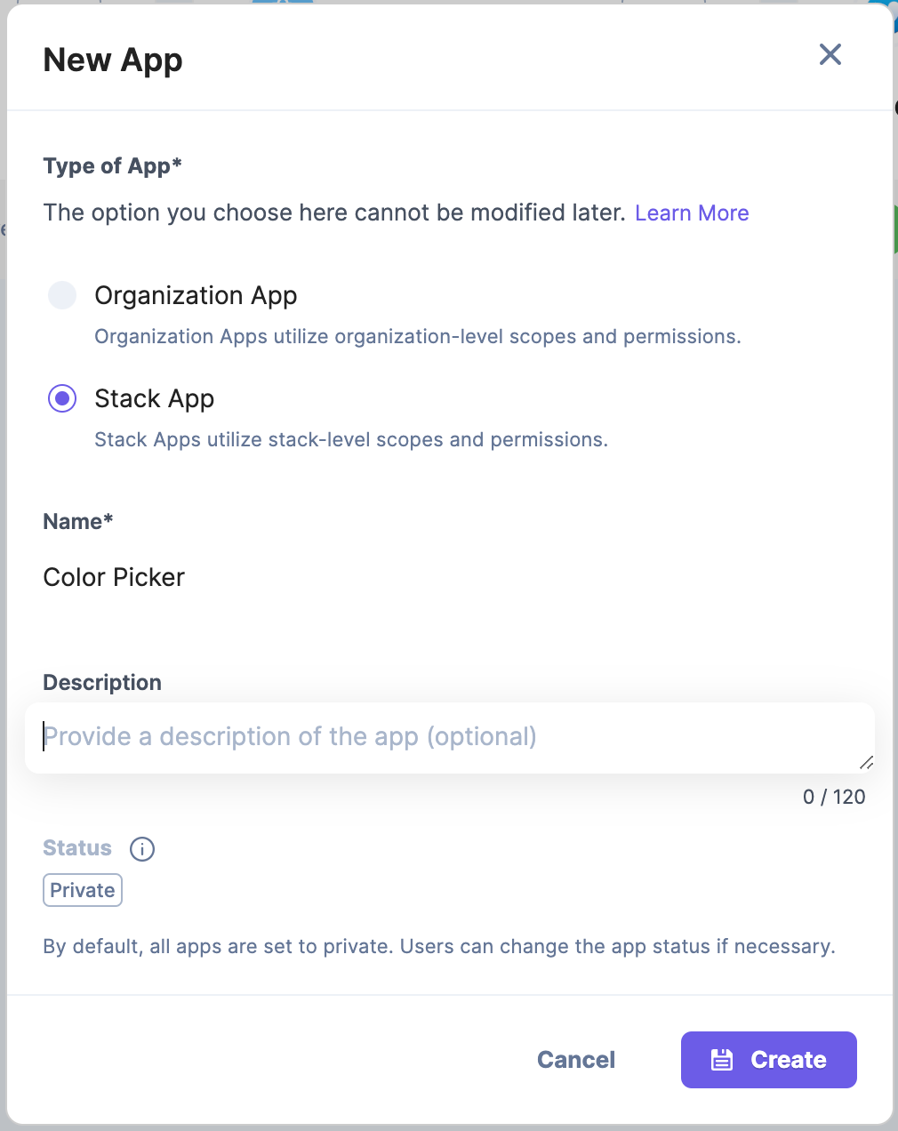
- Click the Create button.
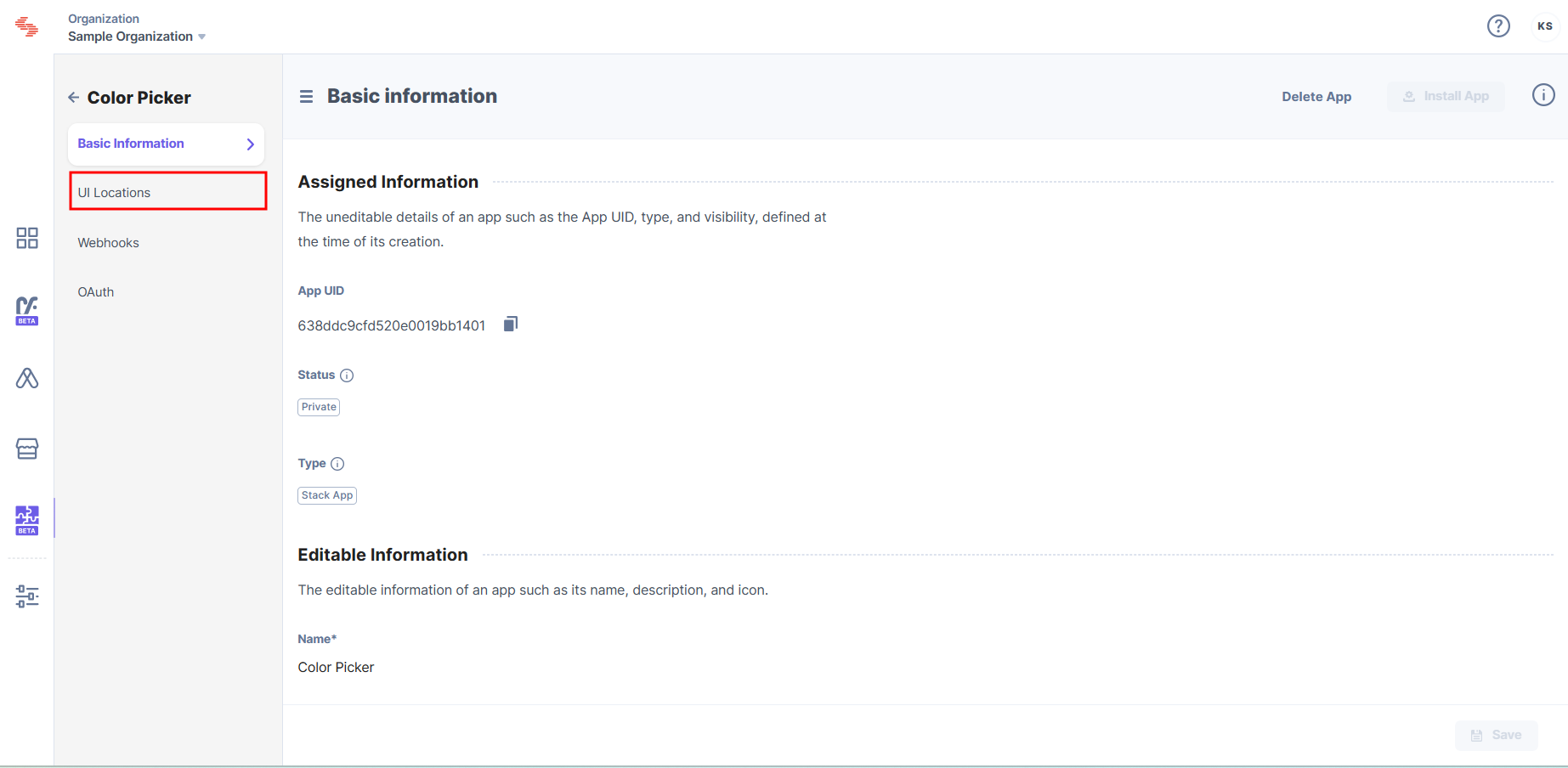
- On the Basic Information page, you can view the details about your app.
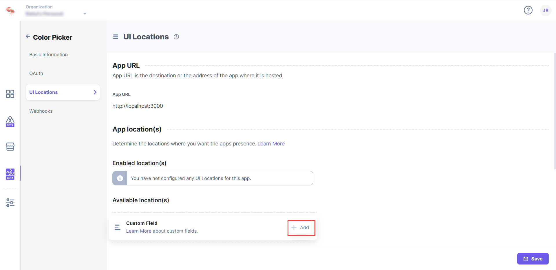
Configure UI Locations
Next step is to declare where you want the app to appear in the Contentstack interface with the UI location section. Follow the steps given below to configure the Custom Field UI location for our newly created Color Picker app.
- In the left navigation panel, click the UI Locations tab.
- Enter the App URL. This is the URL, where our app is running. Since we are running our app locally the URL is http://localhost:3000.
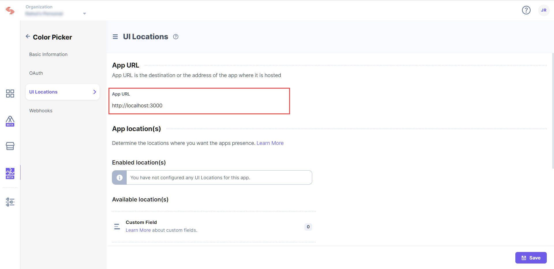
The App Location(s) section is enabled once you enter the App URL. - Hover over the Custom Field UI Location, and click the + Add button.
- Enter the details for the Custom Field configuration.
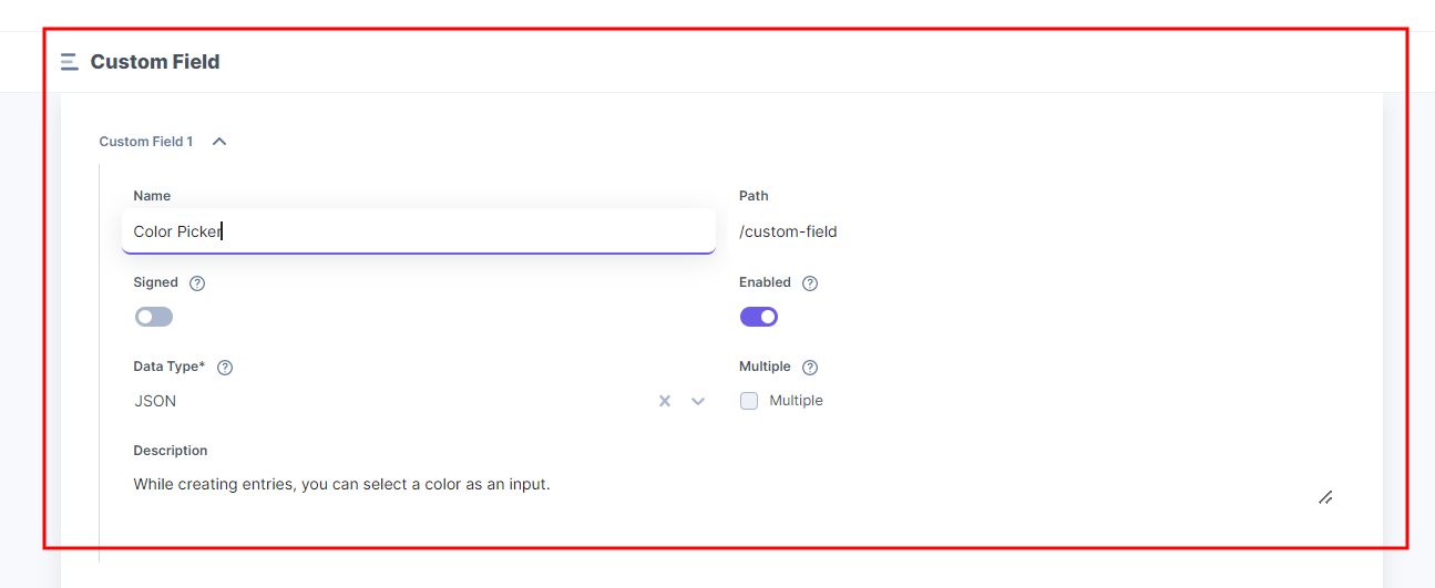
- Name (optional): By default, the app name is set as the location name. Enter appropriate names for the location, when you have more than one location of the same type.
- Signed (required): When enabled, all the initial page load calls will contain a JWT token than can be used to verify whether the page load request originated from Contentstack itself. For more information, refer to the Signed Locations document.
- Path (optional): Allows you to configure the location URL path relative to the App URL. This is particularly useful when the developer wants the app to appear in multiple locations. For example, enter the path as /custom-field.
- Data Type (required): Define what kind of data type this custom field location is storing. For example, select the data type JSON.
- Description (optional): Enter a suitable description for your UI location. This description will be visible on the entry page when the user uses the custom field location.
- Enabled (required): Allows you to define whether the location should be enabled or disabled while installing the app. Keep the location enabled to get the proper results after implementation.
- Click Save to add the UI location to the app.
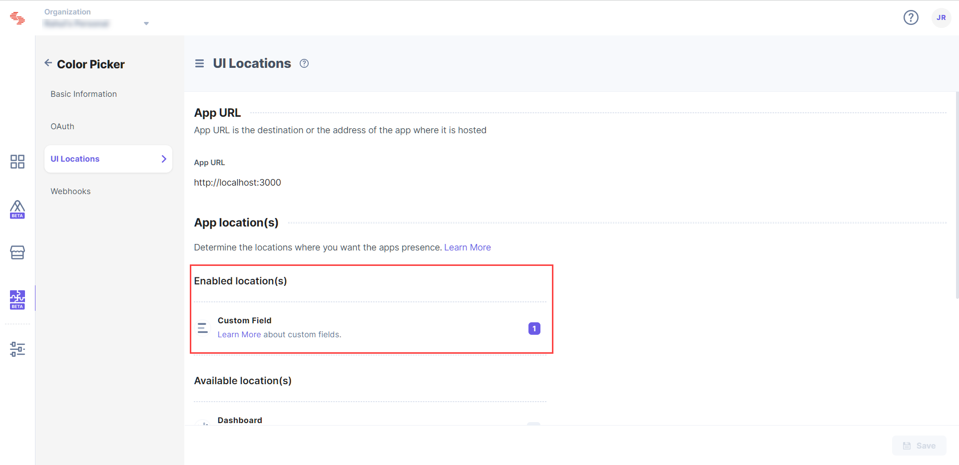
On saving, you will be directed to the UI Locations tab. You will see that one location has been configured in the App Locations section.
- In the left navigation panel, you will find an icon for Developer Hub (as shown below). Click the icon to go to the Developer Hub.
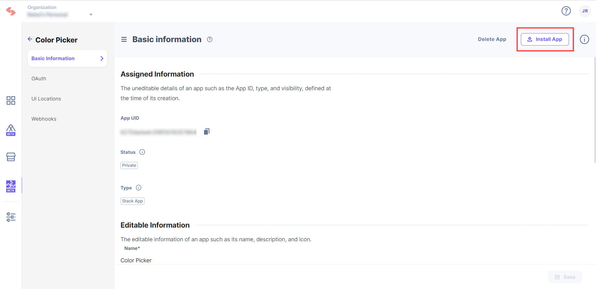
Install the App
Now that you have completed configuring your app, you can go ahead and install the app on any stack of your choice.
- Click the Install App button in the top right corner.
- Select the stack within which you want to install the Color Picker app. Check the terms of service checkbox and click Install.
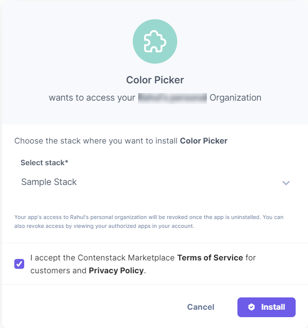
Congrats, your app is now installed. You will be redirected to the Installed Apps section in the Marketplace.
- Click the Install App button in the top right corner.
See your App in Action
Now that you have installed the app, you can go ahead and add it to your content type. Go to the stack in which you have installed the app and follow the steps given below:
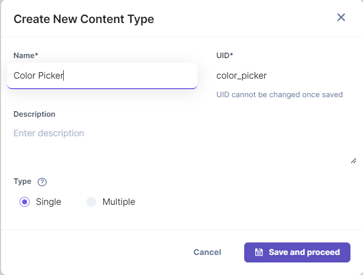
- Click the “Content Models” icon on the left navigation panel, and click the + New Content Type button.
- Create a content type by adding relevant details as displayed below:
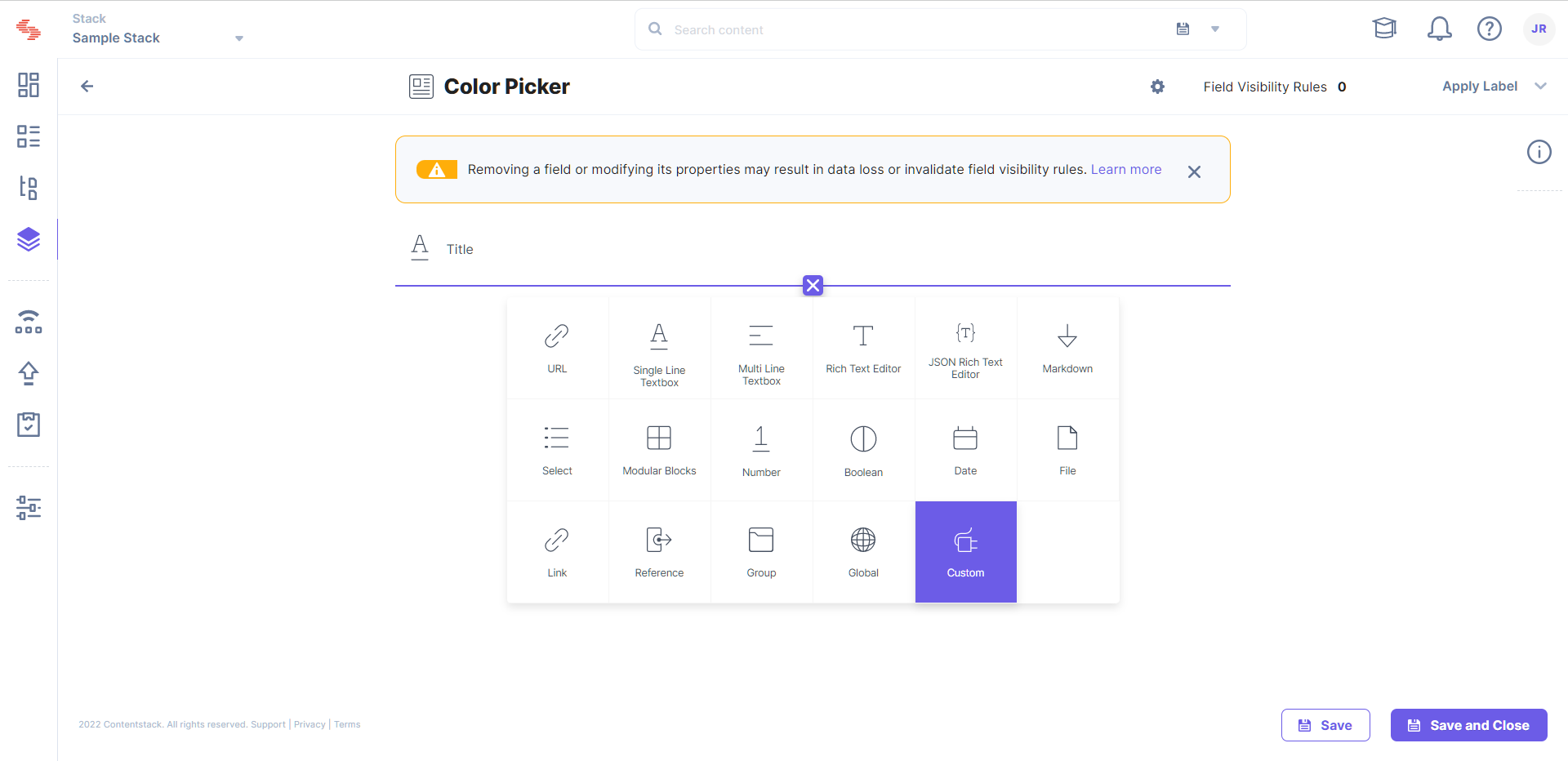
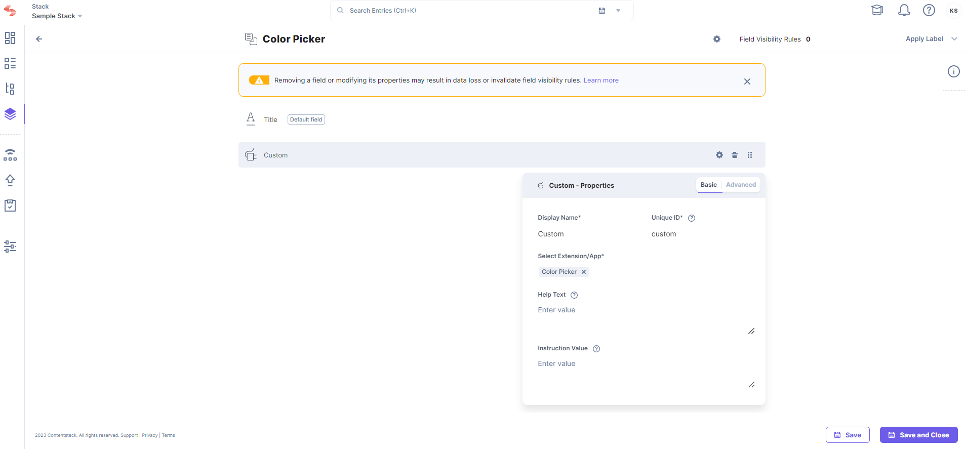
- In the Content Type Builder page, add a Custom field to your content type by clicking the “Insert a field” link denoted by a + sign.
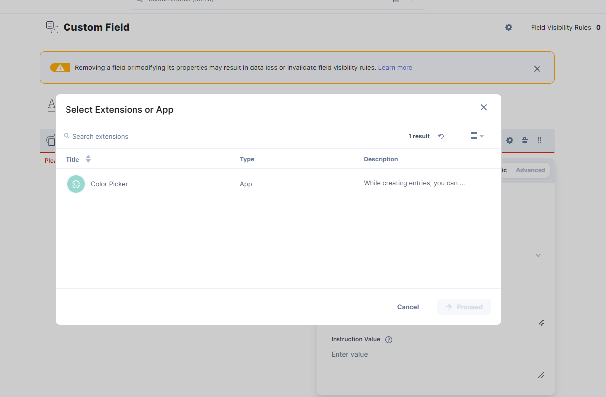
- Under Select Extension/App, select the app you created.
- After adding the fields, click either Save or Save and Close to save your changes.
Now, when you create an entry for that content type, you will see your app in action.
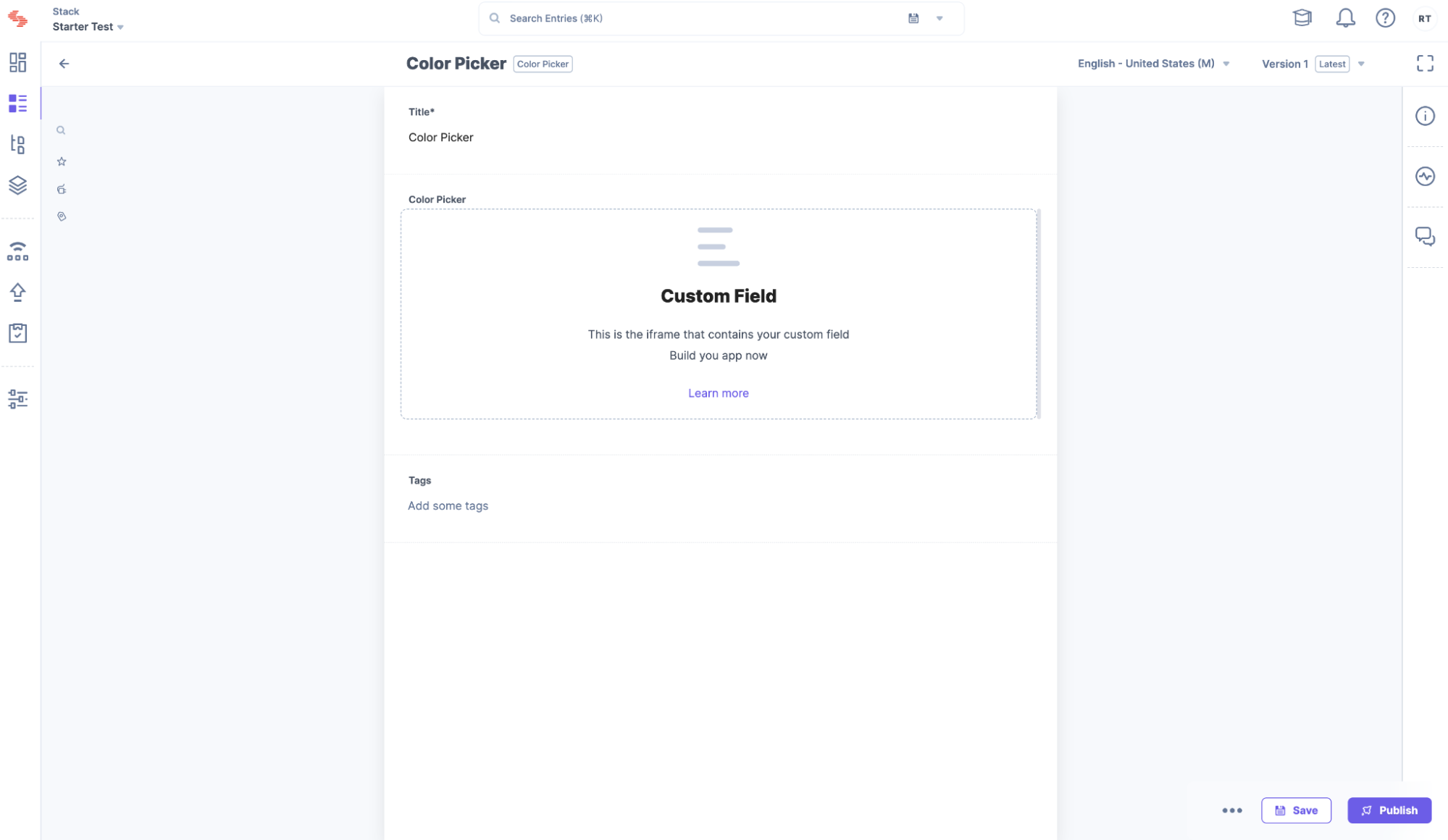
If you see a custom field, it means the app was successfully loaded. Now let's go ahead and complete the implementation.
Implement your App
For the Color Picker app that you are making, you must first install some dependencies. So, on your terminal, type the command below to install the dependencies.
$ npm i reactcss react-color @contentstack/venus-components@1.0.5
$ npm i --save-dev @types/react-color
Add the Color Picker type to the Type file in /src/common/types/types.ts
export interface ColorPickerData {
    showPicker: boolean;
    pickerColor: {
        r: any;
        g: any;
        b: any;
        a: any;
    };
}
In the /src/containers/CustomField/CustomField.tsx file, replace the custom field code with the code given below:
/* Import Node modules */
import { useEffect, useState } from "react";
import { SketchPicker } from "react-color";
import reactCSS from "reactcss";
import { InstructionText } from "@contentstack/venus-components";
import { isEmpty } from "lodash";
/* Import our modules */
import localeTexts from "../../common/locales/en-us/index";
import { ColorPickerData } from "../../common/types/types";
import { useAppSdk } from "../../common/hooks/useAppSdk";
import { useCustomField } from "../../common/hooks/useCustomField";
/* Import our CSS */
import "./styles.css";

const CustomFieldExtension = () => {
  const appSdk = useAppSdk();
  const { customField, setFieldData }: any = useCustomField();
  const [stateColor, setColor] = useState<colorpickerdata>({
    showPicker: false,
    pickerColor: {
      r: "108",
      g: "92",
      b: "231",
      a: "100",
    },
  });

  const styles = reactCSS({
    default: {
      color: {
        width: "70px",
        height: "30px",
        borderRadius: "4px",
        background: `rgba(${stateColor.pickerColor.r}, ${stateColor.pickerColor.g}, ${stateColor.pickerColor.b}, ${stateColor.pickerColor.a})`,
      },
    },
  });

  const togglePickerVisibility = () => {
    setColor((prev) => ({
      showPicker: !prev.showPicker,
      pickerColor: prev.pickerColor,
    }));
  };

  const closePicker = () => {
    setColor((prev) => ({
      showPicker: false,
      pickerColor: prev.pickerColor,
    }));
  };

  const pickerColorChanged = (colour: any) => {
    setColor((prev) => ({
      showPicker: prev.showPicker,
      pickerColor: colour.rgb,
    }));
    setFieldData(colour);
  };

  useEffect(() => {
    appSdk?.location.CustomField?.frame?.updateHeight?.(350);

    if (!isEmpty(customField) && customField !== null) {
      setColor({
        showPicker: false,
        pickerColor: customField.rgb,
      });
    }
  }, [customField]);

return (
    <div className="layout-container">
      <InstructionText testId="color-picker-text">{localeTexts.CustomField.instruction}</InstructionText>
      <div>
        <div className="swatch" role="none" onClick={togglePickerVisibility} onKeyDown={togglePickerVisibility}>
          <div style={styles.color} />
        </div>
        {stateColor.showPicker ? (
          <div className="popover">
            <div className="cover" role="presentation" onClick={closePicker} onKeyDown={closePicker}>
              <SketchPicker color={stateColor.pickerColor} onChange={pickerColorChanged} />
            </div>
          </div>
        ) : null}
      </div>
    </div>
  );
};

export default CustomFieldExtension;
In the /src/containers/CustomField/, create a styles.css file and add the custom field CSS with the code given below:
.layout-container {
  padding: 5px;
  margin: -28px 0;
}
.layout-container .InstructionText {
  text-align: left;
  color: #647696;
  display: block;
  font-family: Inter;
  font-size: 0.75rem;
  line-height: 1.5;
}
.layout-container .swatch {
  padding: 5px;
  background: #fff;
  border-radius: 1px;
  box-shadow: 0 0 0 1px rgb(0 0 0 / 10%);
  display: inline-block;
  cursor: pointer;
}
Add new strings to Custom Field object node in locales in /src/common/locales/en-us/index.ts.
CustomField: {
. . .
instruction: "Pick a Color",
},
Stop and restart your React project:
$ npm start
Reload the entry page, and now you will see an actual Color Picker loaded into the custom field.
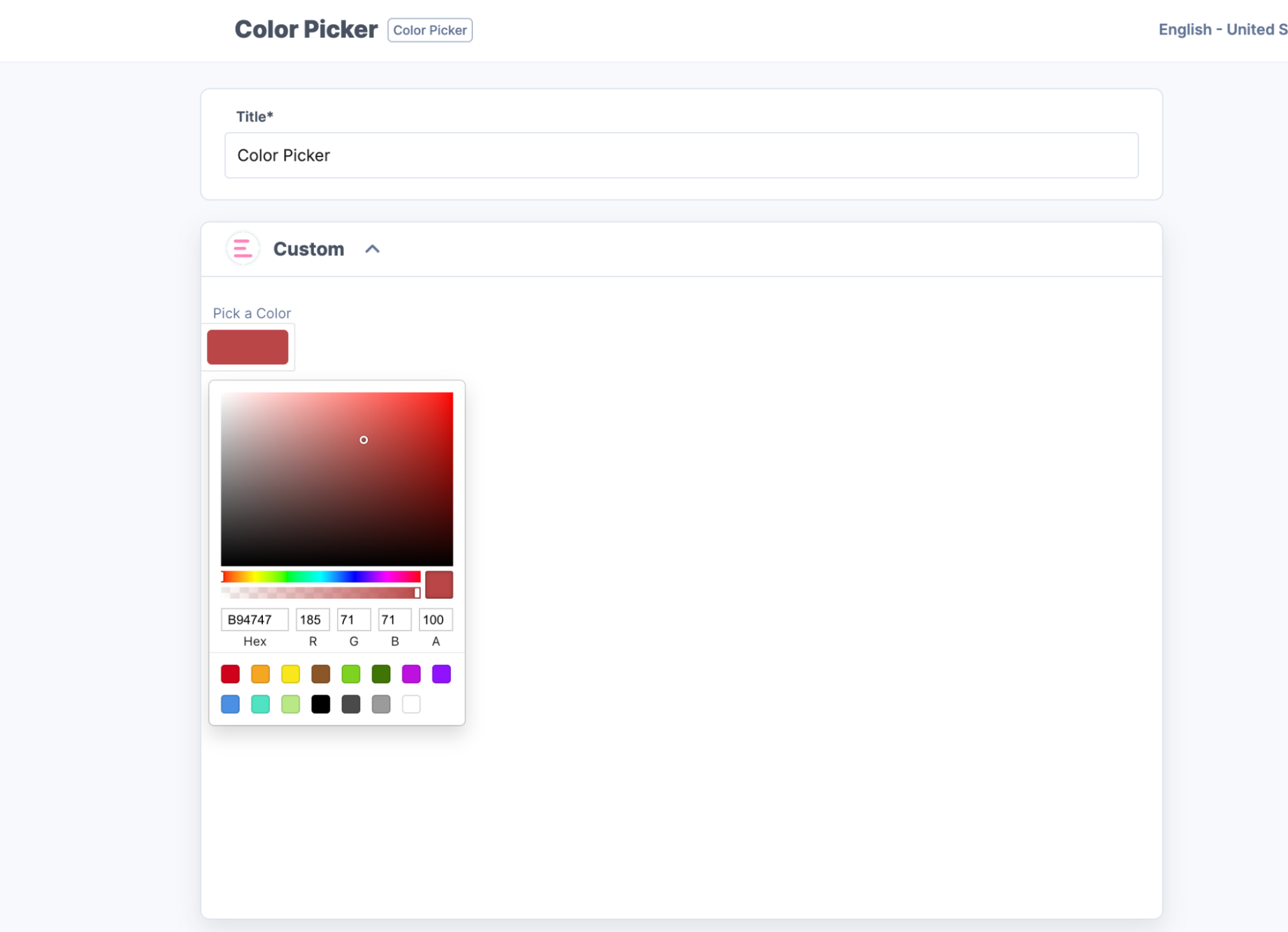
Save any color and reload, and verify if the app is saving data and fetching it on reload.
Next Steps
- Secure your application:
Using the signed support, you can learn how to secure calls to outgoing APIs from the Contentstack UI and backend using the Contentstack App Framework. - Host the app:
Now that your app is ready, host it for your team to use. You can host the app on external services like Netlify, Vercel, etc. - Submit for publishing:
Once your application is production-ready and you want to share your solution with Contentstack Marketplace, you can check the App Submission and Approval Guide.
- Secure your application:
- Navigate to the newly created folder and start the app by running the following commands:
More articles in "Quickstart"
