

Set Up Studio for Your Project
Note: Studio is currently part of an Early Access Program and may not be available to all users. Contact the Contentstack support team; they will coordinate with the appropriate stakeholders to review eligibility.
Studio is Contentstack’s unified environment for designing, structuring, and managing composable digital experiences.
This guide demonstrates how to apply the foundational concepts from Get Started with Studio to set up your own project, including environment configuration, component registration, Figma sync, and workspace setup. You can use a CSR React project that leverages the Contentstack Delivery SDK to fetch and render data, and then use Contentstack Studio to add a new Feature section in the middle of the page.

Prerequisites
Before configuring your Studio project, verify that your environment is ready. This ensures you have the required access, integrations, and tools for a smooth setup.
- You have Admin or Developer access in Contentstack.
- The Studio feature is enabled for your stack.
- (Optional) You have access to the Figma Plugin for component synchronization.
- (Optional) The Contentstack CLI is installed (v2.0 or later).
The setup process includes creating a project, defining your environment, registering components and tokens, creating compositions, and deciding how you’ll use them, either within the Playground Canvas or in a connected front-end.
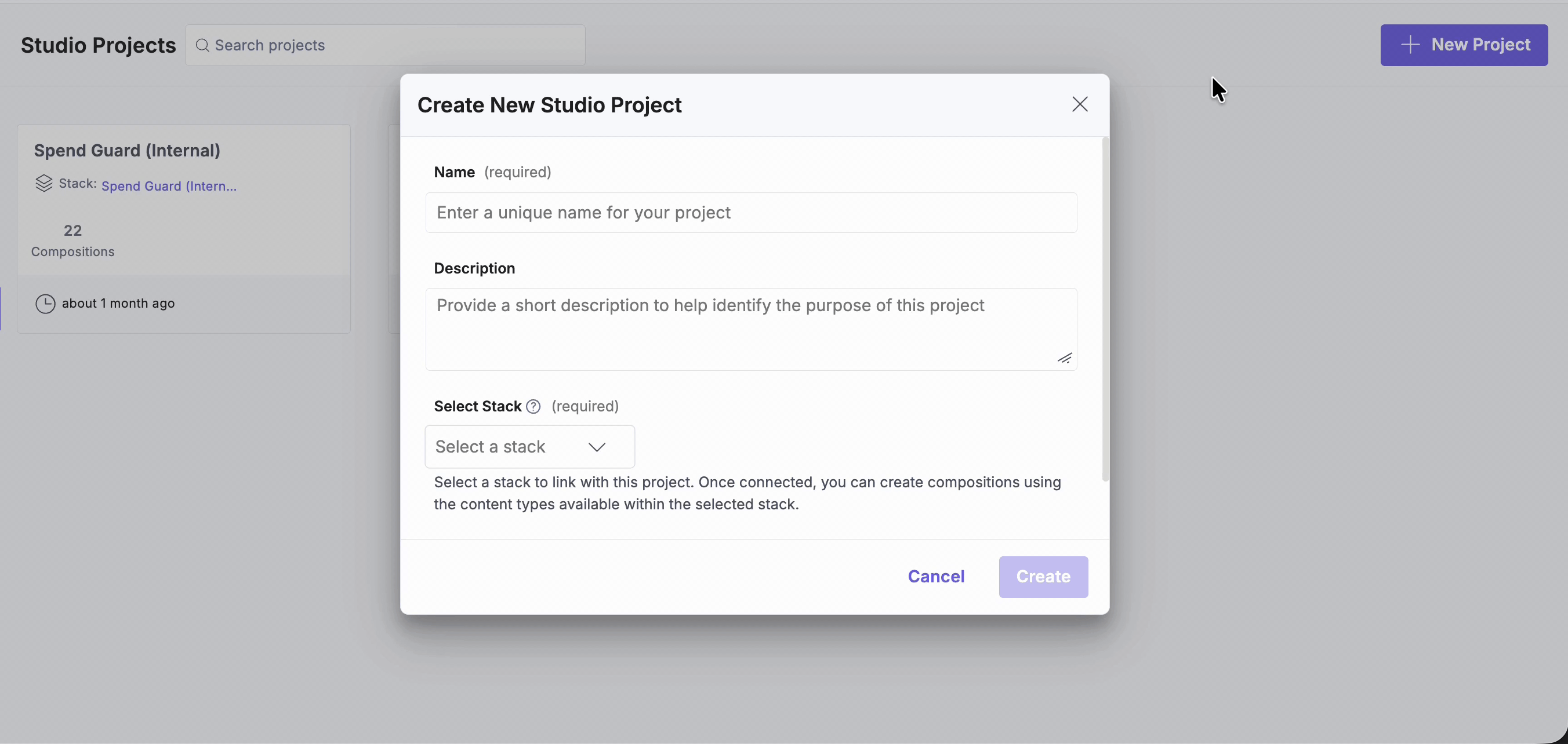
Create a Project
A Studio project links your stack to a structured workspace where compositions, components, and tokens live.
To access and create with Studio, log in to your Contentstack account and perform the following steps:
- Select Studio from the “App Switcher”.
- If you are accessing Studio for the first time, click New Project.
- Enter a Project Name and Description.
- Select the Contentstack stack you want to link. By default, Studio stores compositions in a content type named compositions.
Note: You don’t need to change this setting. However, if your stack already has a content type named “compositions”, you can expand Advanced Settings to specify a different content type name and UID for storing compositions.
Tip: Use a project name that reflects the initiative or site (e.g., “Marketing Site 2025” or “Customer Portal”).
Import the SDKs
Studio requires two SDKs:
- Studio React SDK
This SDK provides the tools to fetch and render compositions from Studio.
Run one of the following commands in your project directory:
npm i @contentstack/studio-react
Or
yarn add @contentstack/studio-react
- Contentstack Delivery SDK
Studio uses this SDK internally to fetch your content from the CMS.
npm i @contentstack/delivery-sdk
Or
yarn add @contentstack/delivery-sdk
Note: Since the Delivery SDK is already installed in the project for data fetching, you only need to install the @contentstack/studio-react package.
Configure Project Settings
Project Settings define how Studio connects to your Contentstack stack and rendering environment. Proper configuration ensures accurate previews, environment consistency, and correct localization when building or testing compositions to your linked stack.
- In your Studio project, open the Settings tab.
- Under Configurations, select the Environment and Language to load the correct Base URL.
Note: You must configure the environment, base URL, and language in your stack settings.
- The Base URL configured against the selected environment is displayed.
- Click Save.
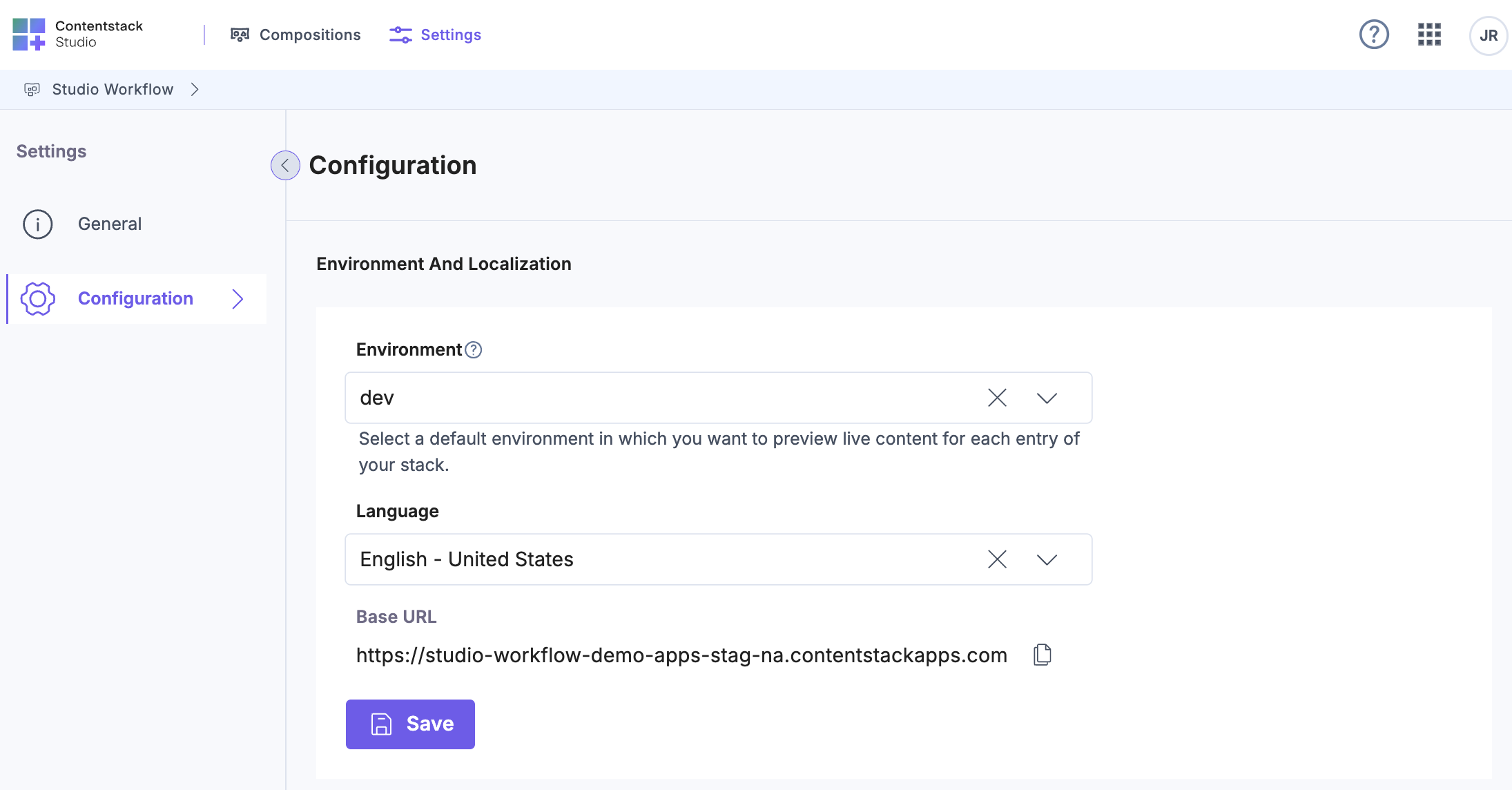
Tip: Always ensure the Base URL and Environment settings match your active front-end deployment context to prevent preview mismatches or rendering errors.
Set Up Studio SDK in the Front-End Integration
Connecting Studio to your front-end enables live previews and deployment.
- Install the Studio SDK and any required dependencies in your front-end codebase (CSR or SSR).
- Add the generated Composition UID (covered later) to the appropriate route or page in your front-end code.
- Ensure Studio has access to the correct environment and locale via the Project Settings tab.
Note: This step is optional if you plan to use Studio as a standalone playground for testing.
Tip: If you don’t have front-end access, you can still use Studio to build and preview compositions directly within the playground Canvas.
In this case, a CSR page is used; therefore, create a studio/index.ts file under the src folder and initialize the SDK.
import { stack } from "@/contentstack/contentstack";
import { studioSdk } from "@contentstack/studio-react";

studioSdk.init({
  stackSdk: stack,
});
Ensure that this file is executed when the project runs. This requires importing it in a location that initializes on every page. In this example, main.tsx serves as the entry point where the import should be added.
import { StrictMode } from "react";
import { createRoot } from "react-dom/client";
import App from "./App.tsx";
import "./main.css";
import "./studio/index.ts";

createRoot(document.getElementById("root")!).render(
  <StrictMode>
    <App / >
  </StrictMode>
);
Register Your Own Components (Optional)
Registered components form the reusable building blocks of your project. Each component can represent a UI section (such as a Hero Banner or Product Card).
Note: This step is optional if you plan to use Studio as a standalone playground for testing.
Register Components Manually
- Within the Studio folder in your code, create a file called register-components.ts. Import the components and use the registerComponents() method to register the components as shown in the example below.
In this example, the Feature Container component includes three props. Once registered, its display name and description appear in the Studio canvas, allowing you to identify and reuse the component easily.
import { FeatureContainer } from "@/components/feature-section/FeatureContainer";
import { registerComponents } from "@contentstack/studio-react";

registerComponents([
  {
    type: "feature-container",
    component: FeatureContainer,
    description: "The container designed to display the Feature Section",
    props: {
      typographySection: {
        type: "slot",
        displayName: "Typography Section",
        helpText: "You can place Headers and Descriptions here",
      },
      cardsSection: {
        type: "slot",
        displayName: "Cards Section",
        helpText: "You can place your Cards here",
      },
      rightSection: {
        type: "slot",
        displayName: "Right Section",
        helpText: "You can place your images or other content here",
      },
    },
  },
]);
Repeat this process to register the remaining components.
- Import this file into the index.ts file in your Studio folder so that it loads automatically when the SDK initializes.
import { stack } from "@/contentstack/contentstack"; import { studioSdk } from "@contentstack/studio-react"; import "./register-components"; studioSdk.init({ stackSdk: stack, }); - Save the file.
Register Components via CLI
Use the CLI to streamline registration and maintain consistency across multiple projects.
csdx studio:component:register --component-path=<component-path>or
csdx studio:component:register --component-dir=<component-dir>After registration, run the CLI sync command to update your components across all Studio environments. This ensures that the Figma Plugin recognizes the registered components and uses them correctly during design export.
csdx studio:component:sync --component-path=<component-path>Additional Resources: Learn more in our Register Component section in the Work with the Studio CLI documentation.
Note: When you export from Figma, it retains context of your components if they’ve been registered and synced with Studio.
Register Tokens (Optional)
Tokens define design rules that maintain consistency across pages, such as color palettes, typography, and spacing. These tokens can be imported from Figma or added manually.
- Within your project’s Studio folder, create a file named register-design-tokens.ts, and register your design tokens using the registerDesignTokens() function.
import { registerDesignTokens } from "@contentstack/studio-react";

registerDesignTokens(
  {
    colorTokens: {
      primary: "#004D6E",
      secondary: "#EBF9FB",
      midnight: "#091133",
    },
    spaceTokens: {
      "4xl": "4rem",
      "5xl": "5rem",
      "6xl": "6rem",
      "7xl": "7rem",
      "8xl": "8rem",
      "9xl": "9rem",
      "10xl": "10rem",
    },
    border: {
      color: {
        secondary: "#E7ECFF",
      },
    },
  },
);
Additional Resource: For more details, refer to the Setting Design Guardrails section in the Styling Your Compositions document.
- The registerDesignTokens() function also accepts an optional second parameter for configuration. You can use this parameter to set the allowedValuesLevel property to one of the following:
- dynamic allows adding values only from the CMS.
- tokens enable design tokens in addition to CMS values.
- arbitrary allows any custom or random values.
For the least restriction, set allowedValuesLevel to arbitrary.
registerDesignTokens({...}, { allowedValuesLevel: "arbitrary" }) - Import this file into the index.ts file in your Studio folder so that the values register when the SDK initializes.
import { stack } from "@/contentstack/contentstack";
import { studioSdk } from "@contentstack/studio-react";
import "./register-components";
import "./register-design-tokens";

studioSdk.init({
  stackSdk: stack,
});
Note: This step is optional if you plan to use Studio as a standalone playground for testing.
Tip: Keep token naming consistent with your organization’s design system (e.g., primary-color, font-heading-xl).
To register tokens via the CLI:
csdx studio:design-token:addWhen executed, this command analyzes your project, attempts to extract design tokens from your project code (including CSS), and automatically generates a token registration file. You can then use this file directly in Studio without having to manually implement the syntax.
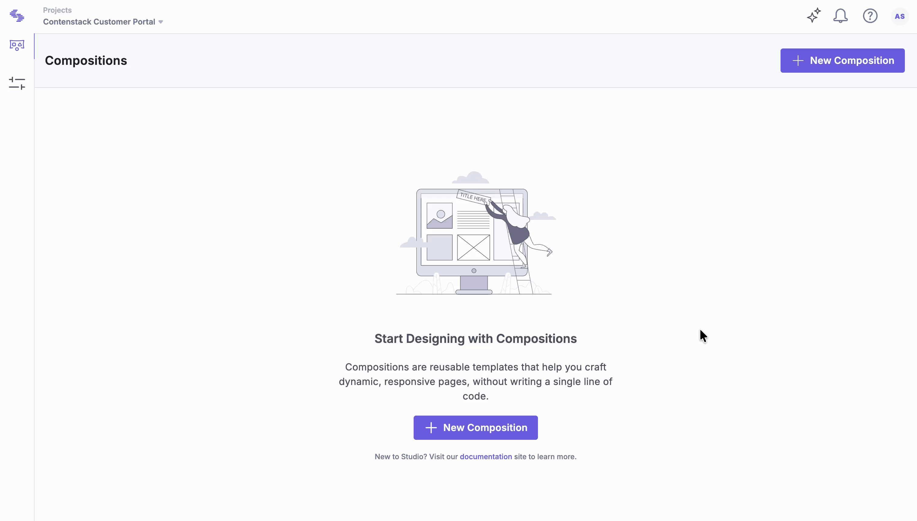
Create a Composition
Compositions are structured layouts for pages. Create a linked composition template for content types with multiple entries, and use a freeform composition for single-entry (singleton) content types or standalone pages.
- Open the Compositions tab and click New Composition.
- Choose Linked (multiple entries share one template) or Freeform (one-off page).
Additional Resource: Learn more about the types of compositions through our documentation.
- Let’s select the Freeform composition for this setup.
- Enter a Name and review the auto-generated UID (you can edit it).
- For the Freeform composition, you need to define the URL Path. This URL acts as the place where this composition is hosted.
- Click Create to open it in Canvas.
Tip: If you plan to bind content immediately, ensure your content types and entries exist in the selected environment.
To add a Features section to the homepage in Studio, create a freeform composition named Features, with the composition UID features and the URL path / to represent the homepage.
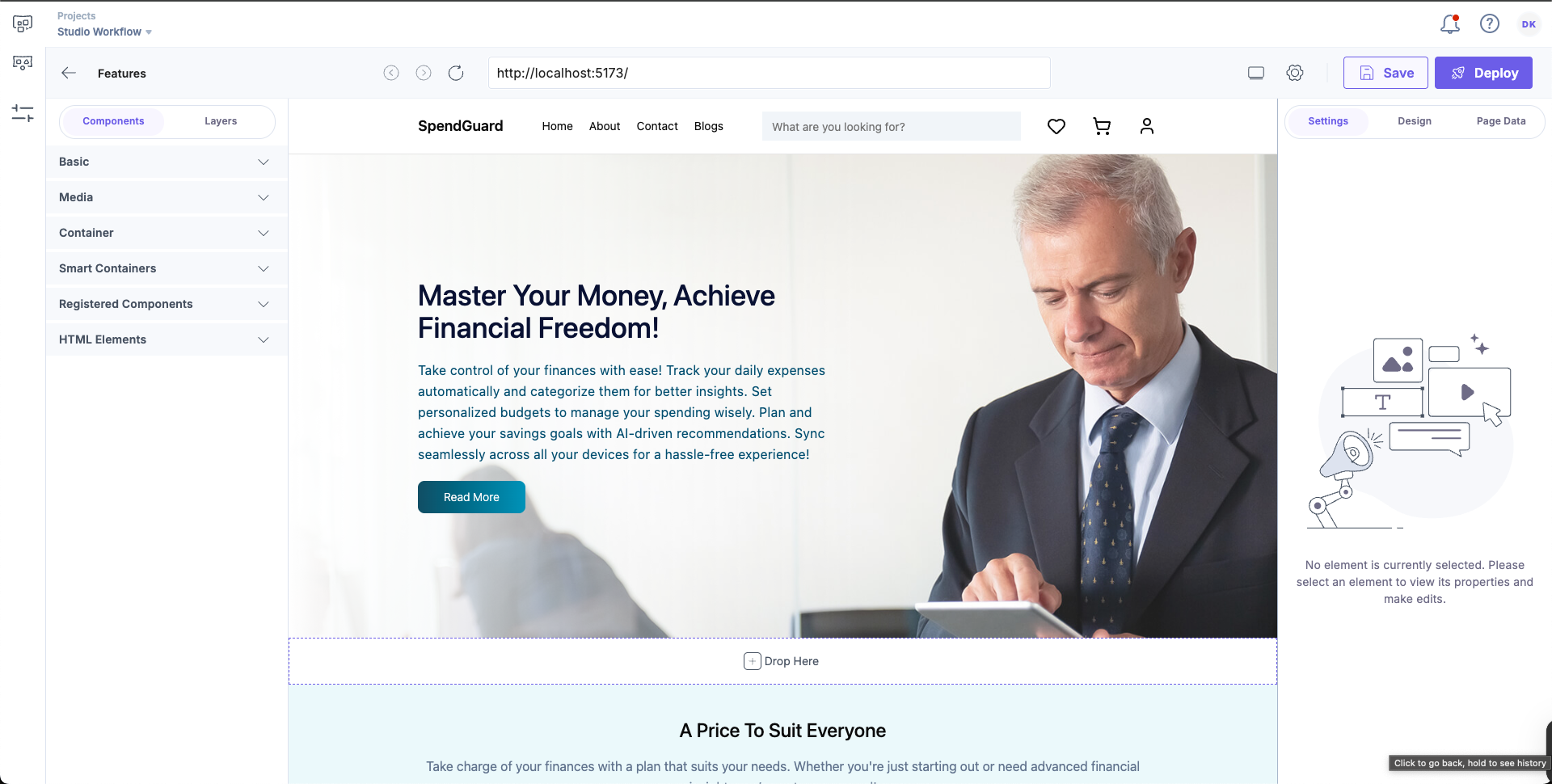
Use a Composition in the Playground Canvas or Front-end
Open the file that corresponds to the URL path you defined when creating the composition, or open the Playground Canvas directly if you are testing it there.
Use in Playground Canvas (no front-end)
Best for quick prototyping and visual validation.
- In Canvas, drag components into your layout.
- Bind entry from your stack in Page Data (Link Entry).
- Adjust styles in Design using tokens/props.
- Click Preview to validate layout and bindings.
- Save your composition. (No live URL; usage stays within Studio.)
Use in a Connected Front-end (actual use)
Best for real previews, routes, and production publishing.
- Open the file that corresponds to the URL path defined for the composition.
- Fetch the spec using the useCompositionData function, since this example uses a CSR app.
Note: For SSR implementations, refer to the Fetch the Studio Spec in SSR section for the required configurations.
Add the following code to the Home.tsx file:
const { specOptions } = useCompositionData({ compositionUid: "features", }); - Next, use specOptions within the StudioComponent component.
The return statement should look like this:
return (
  <main>
    {state.homepage.page_components.map((component) => {
      if (component.hero_banner) {
        return <HeroBanner heroBanner={component.hero_banner} />;
      } else if (component.price_section) {
        return <PriceSection priceSection={component.price_section} />;
      } else if (component.feature_section) {
        return <StudioComponent specOptions={specOptions} />;
      }
      return null;
    })}
  </main>
);
Now, when you open the composition again in the Studio, you’ll see that a new drop zone has been added to the canvas.
Additional Resource: For foundational concepts and examples, refer to Get Started with Studio (Create a Composition, Use the Composition UID in Code, and Preview and Deploy) document.
Tip: Ensure that the front-end preview URL matches the Base URL configured in Project Settings; otherwise, the Studio preview will not load correctly.
Playground vs. Connected Front-end
The following comparison helps determine when to use each mode.
- Playground Canvas:
- No live URL; best suited for prototyping and early-stage content design.
- Cannot deploy pages.
- Does not support custom components or design tokens.
- Connected Front-end:
- Required for production pages and stakeholder reviews on live URLs.
- Allows page deployment.
- Supports custom components and design tokens.
Both modes enable page creation and testing, but connecting a front-end unlocks full publishing capabilities, routing, and stakeholder preview access.
The above example demonstrates how a Studio component can be added as one of the sections in an existing CSR page.
Setting up Studio for a project establishes the foundation for a unified design and development process. Linking components, compositions, and tokens creates a single source of truth, enabling consistency, efficiency, and real-time collaboration across teams.
More articles in "Key Use Cases"
