

Layers
Every component, container, and section dropped onto the canvas becomes a layer. The Layers tab in the left panel shows them as a tree, selectable, reorderable, nameable.
Think of it as the DOM tree of your composition, with a UI for navigating it.
Why the Layers Tab Matters
The canvas shows your composition visually, but as it grows, finding the right element to select gets harder. Five nested Boxes look like overlapping rectangles; the Layers tab makes the hierarchy explicit.
You'll reach for Layers when:
- A component is hidden behind another and you can't click it on the canvas
- You want to move something deep in the tree to a different parent
- You want to verify the structure matches your intent (especially for nested Sections + slots + Repeaters)
- You want to rename a layer so it's recognisable to other authors
Where It Lives
Left panel: Layers tab (sibling to the Components tab).
The Layers tab and Components tab are not shown simultaneously, you can only view one at a time. Switch with the tab toggle at the top of the left panel.
What You See in Layers
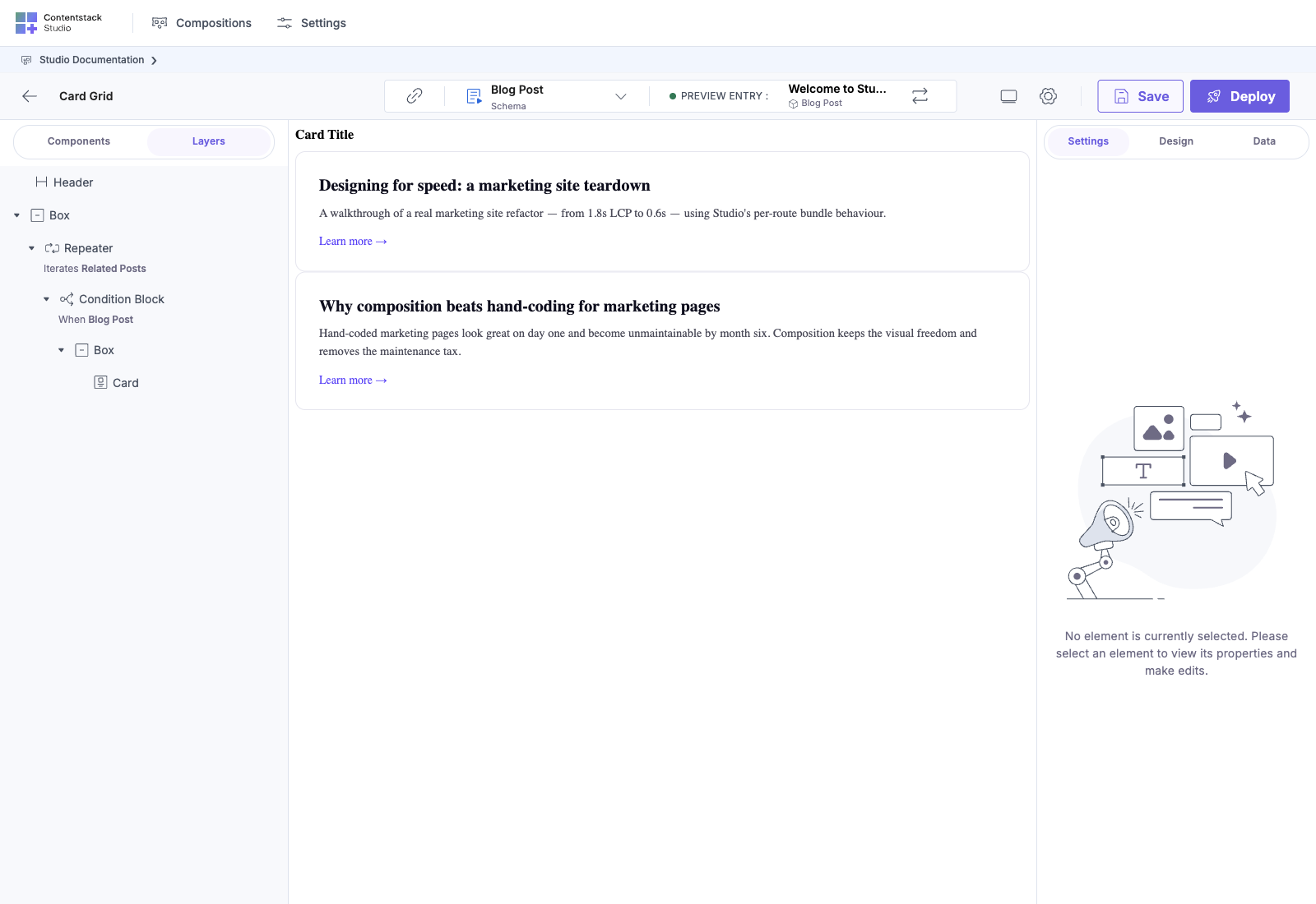
A tree rooted at the composition's top-level node, with one row per child, recursively. Each row shows:
- An icon for the component type (matching the palette tile)
- The component's layer name (defaults to the component's display name; renameable)
- An expand/collapse arrow for layers with children
Selecting a layer in the tree:
- Highlights the matching element on the canvas
- Switches the right panel to that element's Settings / Design / Data
- Scrolls the canvas if the element is off-screen
Common Patterns the Layers Tab Reveals
A clean template
Four top-level children, clear groupings. Easy to scan.
A Repeater iterating
The Repeater shows its iterations as children. You can see at a glance that this Repeater is iterating and what it iterates over.
A section with slots filled
Slots show up as their own rows with their label, and filled slot contents nest underneath. You can verify the chained section-inside-slot pattern is wired correctly just by reading the tree.
Multiple instances of the same section
Same section, two instances, two different bindings. The Layers tab gives each a distinct row.
Renaming a Layer
Default layer names are the component's display name (Box, Heading, Section: card_grid). Useful for identifying what a layer is, less useful for identifying what it means in the composition.
Right-click a layer: Rename. Give it a meaningful name:
- Box → Hero container
- Heading → Page title
- Box → Footer wrapper
Names are per-composition: they don't change the component everywhere, just this drop instance.
Renamed layers are easier to navigate, easier to discuss in review ("the Hero container needs more padding" beats "the third Box from the top"), and easier to onboard new authors to.
Reordering Layers
Drag a layer in the tree to a new position. Studio updates the canvas accordingly.
You can:
- Reorder siblings (move a layer up or down within the same parent)
- Re-parent (drag a layer into a different container)
- Promote / demote (move a layer up to its grandparent, or down into a sibling)
For complex moves, drag-on-canvas is often awkward; drag-in-Layers is precise.
Component Menu: Right-Click on a Layer
Right-click any layer to open its menu. Typical options:
- Rename: set a custom layer name
- Show / Hide: toggle layer visibility
- Lock / Unlock: prevent edits to the layer
- Duplicate: copy the layer + all children to a sibling position
- Copy Style / Paste Style: duplicate design properties across layers
- Delete: remove the layer and all children
Exact menu items vary by component type. Slots, Repeaters, and Condition Blocks have menu items specific to their role (e.g. "Add Condition Block" on a Condition Block container).
Best Practices
Name layers when the structure isn't obvious. A Box named Hero container is much easier to navigate to than the fourth Box from the top. Spend two minutes naming when you save.
Keep nesting shallow. Five levels of nested Boxes are technically fine but unfriendly to read. Use Sections to encapsulate deep structures, see Sections overview.
Don't fight the structure for visual reasons. If a layout needs a wrapper Box for CSS grid, that's fine, it shows up in Layers and authors will tolerate it. If a wrapper exists only to hide complexity, refactor into a Section instead.
Use Layers to debug binding scope. If a binding inside a Repeater isn't resolving, click the layer in the Layers tab: the right panel shows you exactly which scope it lives in. Same idea for nested Repeaters and Condition Blocks.
Common Pitfalls
| Symptom | Cause | Fix |
|---|---|---|
| Can't find a layer on the canvas, Layers shows it but the canvas seems to skip it | The layer might be hidden behind another, or have zero size | Click the layer in the Layers tab; the right panel will let you adjust visibility / size |
| Renaming a layer doesn't propagate | Names are per-instance, not per-component | Rename in each instance, or rename the component's displayName in the registry (which changes the default name everywhere) |
| Reordering a layer breaks bindings | A binding inside the moved layer referenced a parent scope that changed | Re-bind after the move, or use a less scope-sensitive path |
See Also
- Using sections and components in a template, the broader canvas flow
- Section Slots, slots get their own Layers rows
- Repeaters, iteration shows in Layers
